.png)
Introduction
As a marketer, you are undoubtedly confident in producing engaging, informative, and valuable collateral to attract new leads and delight your loyal customers. But when it comes to writing reports for your colleagues, management team, clients, or customers, even experienced marketers struggle.
Marketing research reports can be complex beasts involving data from various channels, contributions from several budget sources, and activities involving multiple departments. Furthermore, our activities and strategies aren’t always easy to understand for non-marketers. Just as we are likely baffled by our Finance colleague’s talk of enterprise value, your teammates will probably draw a blank at how recent SEO improvements positively impacted your CRO.
With this in mind, we have produced a handy guide to help you and your team create and format your research reports for maximum impact. We’ll give you the lowdown on best practices when writing a report and some great ideas to help you plan, produce and distribute reports that deliver a memorable content experience. We’ve included links to valuable resources along the way, plus a best practice checklist to ensure you get it right every time.
We hope this page will act as an information and guidance hub for you and your team, helping you to demonstrate the marketing value and great results you have worked so hard to achieve.
1. Best practices for writing a report
Whether you are new to research report writing or want to improve your current output, it’s always a good idea to ensure you work to best practices. We’ve included a handy checklist at the end to make sure you don’t miss a trick.
Define the purpose of your report
This is the crux of your research report and will inform how the document is composed, which information is included and prioritized, the extent you deep-dive into the data and what high-level information you incorporate, which interactive elements should be included, and so forth.
Think about what you are trying to achieve with your report, who it will matter to, and why (more on identifying your audience in a moment). Will the information be used in a standalone context, or will it be collated with other documents to form a larger report? If so, it might be worth conferring with the owner of the end report to find out what format and design would be most useful for them.
Keep the end-to-end journey of your research report in mind and ensure that purpose is aligned throughout.
Identify the audience for the report
 As mentioned above, marketing can be a bit of an unknown quantity within businesses. When planning and producing your research report, it's important to adapt the information so it is clear and easily understood by your recipients. That means minimizing jargon and marketing terminologies and adding explanations and keys for abbreviations where appropriate.
Structure the information so the recipient can get high-level and granular insights and include links to further sources rather than weighing the main document down with too much information. If people or teams in your business have different interests and agendas, it might be worth composing different versions of the research report for each.
Know your topic inside out
Most of the time, you will know the topic you are reporting on inside out, so don’t be shy of demonstrating your smarts in the report (in a suitably modest and inclusive way, of course). If you are tasked with reporting on something you aren’t knowledgeable about, it’s worth taking some time to research the subject matter before compiling the document. Reports demonstrate that you have expertise in a particular subject, issue, or activity. Any gaps in your knowledge are likely to stick out like a sore thumb.
Create an outline of the report
How you structure the report will depend on the information you are presenting, who you are communicating it to, and how the report will be used. Clarity is a top priority when creating a plan or outline for your report. We’ve created a sample outline below to help you shape your reports.
Compose the report
Once you have a clear plan, you can start creating your report. Always keep in mind that the report should be a great content experience. Just as your eBooks and downloadable guides aim to catch and maintain your reader’s interest, your reports should engage your recipient from start to finish, encouraging them to scroll to the next page or click on the next link. In a later section, we’ll dig deeper into how to create a compelling visual report.
Discover: examples of some great annual reports. 
Edit and proofread your report
Ideally, you should have a couple of trusted colleagues to check over your report before sending it, preferably including one or two people who aren’t familiar with the activities you’re describing. This will help to ensure your information is easy to comprehend and that all the language and illustrations are clear and inclusive.
2. Your checklist for creating reports for maximum impact
Define the purpose of your report
What are you trying to achieve, who will it matter to, and why?
Discover How To Determine and Measure Inbound Marketing KPIs
Identify the audience for the report
Who is the report aimed at, and what are their priorities and interests? Will one report suit all the intended recipients, or will you need different versions?
Remember — keep jargon to a minimum!
Know your topic inside out
Get right under the skin of your topic and demonstrate your smarts. Make sure you know what key information is needed and the main points you want to hit.
Create an outline of the report
Create a plan for your report that will enable you to present your information in the clearest, most cohesive way possible.
- Your title. A short sentence that sets out the goals and/or focus of the report.
- An executive summary with an overview of the topic, data obtained, and findings or recommendations.
- A table of contents with links to the different section headings and sections.
- An introduction. A brief explanation of what the reader can expect from the report and why it should be of interest.
- The main content of the report.
- The conclusion, with recommendations if appropriate.
- References, keys, and appendices.
.png?width=1200&name=Group%20251%20(1).png)
Begin the report
Compose your report, keeping in mind that it should be a great content experience.
Edit and proofread your report
Ask several trusted colleagues to proof and give feedback on the report and make any amends.
3. Why great design matters when creating maximum impact reports
As with your outbound marketing campaigns, you have just seconds to impress your audience with your report and encourage them to find out more. This section will examine why great design matters when creating maximum impact reports. We’ll then explore how to put this into practice.
Great design helps you create a superior content experience
As we mentioned above, providing a great user experience doesn’t stop with your website and outward-facing marketing collateral — your report UX matters too.
The design elements you choose and how you compose the document can significantly affect how a report is consumed. Our brains can take more information on board and process it far more effectively when it’s presented as a mix of visuals and text.
Telling the story of your findings through a clearly presented, compelling, and attractive report can mean the difference between engaging your audience and getting your point across and having your email disappear into the ‘file away for later, but never revisit’ folder.
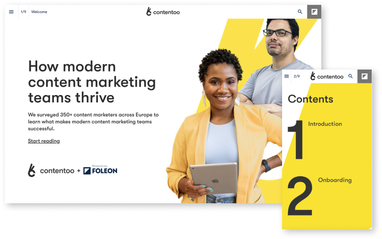
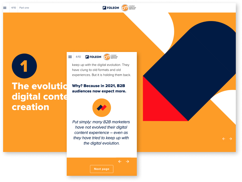
Creating a memorable content experience isn’t easy, especially if you don’t have specialist design skills. The good news is that plenty of powerful, user-friendly tools are out there to help busy marketers create polished, professional reports. With Foleon’s platform, you can choose from a wide range of visually-arresting templates that you can adapt with your unique brand identity. Find out more about how to use design templates and still be creative
Great design makes reports easier to navigate
Seamless, intuitive navigation is a top priority when designing your reports. Here are some tips for getting it right.
- Define the user journey. A clear idea of how your reader will consume the report will pave the way for a great user experience. Think about the layout and flow of the report and the best way to tell your story. What will the reader want to hear about first, and what secondary information should follow. Are there links to additional content that will enhance the reader’s understanding of the information (and help to declutter the main report pages)? Which information should you include at the end of each section to draw the reader onto the next part? What is the best way to conclude your report, and what do you want the reader to do next?
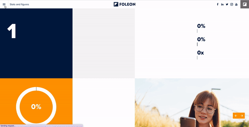
- Format the text, so it scans easily. Walls of text are an absolute no-no. As with your website content, you would never burden your reader with long sentences, extensive paragraphs, and information that isn’t formatted well. Use clear headings, plenty of useful subheadings, callout or highlighted text boxes, and visual cues. Make sure there's plenty of white space. Then break the written content up with useful images, infographics, illustrations, and interactive elements. This brings us neatly to the next point…
- Put the reader in the driving seat. Using interactive elements in your report lets your viewers control how they consume the information. This means they will be far more likely to take the content on board and remain engaged throughout. Popular interactive elements include gamification, video, assessments, calculators, webinars, polls, surveys, quizzes, and infographics.
These three approaches will help you create and format a report that provides an excellent user experience and engages and converts readers. Find out more about why interactive reports are a marketing imperative.
Did you know that interactive elements are great for converting customers, too? Discover 7 examples of interactive content to help sales close more deals.
4. Layout and design tips for maximum impact
Layout and design are super important when creating reports with impact. Here are some tips for producing a document that is a delight to receive and read.
Cover page. As the first point of contact your report has with your recipient, your cover page needs to create an immediate impact. But it must also offer a clear idea of what the reader will get from the report. There’s little point in going all-out bells and whistles if people can’t determine how they will benefit from consuming the content. Your company branding should be visible, and the brand color palette feature throughout the design template. If appropriate, acknowledge the author and mention their job title for added credibility and context.
Your cover page is likely to be the document area with the most space for graphics or illustrations, so make sure you choose them wisely. Avoid stock images, and opt for elegant visuals that offer a true representation of the themes and topics covered in the report. Unless there is one standout text you need to include to grab the audience’s attention, it’s probably best to leave the longer text for the following pages.
Table of contents. Make this section as clear and concise as possible and include links to each chapter.
Header and footer. These design elements needn’t impact your report's overall look and feel but must be consistent and on-brand throughout. Likewise with the page numbers.
Font style and size. The obvious choice is to choose your company typeface. If you want to work with a different font, opt for one that is similar or compliments your brand font and overall style and identity. Use the same font throughout the document. If you want to vary the font palette, limit it to a few colors, so you don’t distract your reader from the content itself.
When it comes to size, use at least a 16px for text-heavy pages. If you aren’t using a lot of text throughout the document, you could try a 20px font size, with larger text for captions and, of course, headings and subheadings. Always test your report on different devices to ensure the text size and the leading (the vertical space between the lines of text) work well on various screens.
Add in captions, page breaks, and other style features. There are bound to be some stand-out bits of information you want to alert your reader, so why not present these in caption boxes? This draws the reader’s interest to your key messages and findings and encourages them to discover more.
Include a good amount of page breaks, bullets, subheadings, and other formatting features to make the report as digestible and approachable as possible.
Choose styles and themes. This can be one of the trickiest parts of creating your report. Deciding on a visual identity that conveys everything you want it to isn’t easy. That’s where design templates step in...
Discover how to create the best B2B content download of your career.
5. How Foleon’s on-brand templates can boost your reports
These handy tools have come a long way in the last few years. Rather than looking like a one-size-fits-all corporate blueprint, today’s templates offer a variety of great design features you can make your own. Here’s how Foleon’s on-brand templates can transform the creation and distribution of your reports.
Foleon’s design templates are responsive out of the box and ready for your unique customization. An extensive design library is available to suit every business and audience.
There’s a minimal technical skill required; you simply drag and drop your text and images into place, set up any interactive elements you want, and you’re ready to go!
Creating intuitive navigation and a seamless user journey is easy. Simply instruct the template on how you want the document to flow, and you’ve got a report that will hold your audience’s attention until the final page.
Need to make changes after the report has been distributed? No problem. With Foleon’s documents, you remain in control.
As an ambitious marketer, you’ll no doubt want to continue to improve your report output over time. Foleon’s platform comes with a powerful analytics package to see how your report is consumed and by which audience. You can use these insights to adjust the structure or content to get optimal engagement with your audience.
Find out more about how to scale and elevate content creation with templates.
6. Will your report stand out from the crowd?
The impact you’re hoping for from your report will depend on the nature of the content and your audience. However, your aim should always be to make it stand out from the crowd.
Here are a few questions to ask yourself when reviewing your final report.
- Have you given your report thorough proofreading, including checks from someone who isn’t familiar with the subject matter?
- Have you checked each user's journey from start to finish? >Make sure you review this on a variety of devices and screen sizes<
- Will it be easy to download? Find out more in our guide to creating the best B2B content download.
- Are all the external links, forms, and downloads working?
- Are all the interactive elements working?
- Is it optimized for SEO (if appropriate)?
Discover: Annual report ideas to turn your content into showpieces.
7. Get ready to create and format reports for maximum impact
So, we reach the end of this guide on how to create and format reports with impact. We hope you are now equipped with all the knowledge and ideas you need to produce eye-catching, compelling, and valuable reports for an internal and external audience.
The first few times you and your team create reports will probably take a little while. Working through the best practice checklist might require a bit more time investment, but once you are familiar with the processes and have grown in confidence, you’ll no doubt find that producing and delivering reports takes no time.
One of the best ways to save precious hours and produce on-brand consistently high-quality interactive reports is to use a platform like Foleon’s. This cost-effective, user-friendly tool can help you create annual reports that engage and entertain your audience from start to finish (check out some examples here), departmental reports that demonstrate your progress and achievement, or any other data or information you need to convey.
Find out more about Foleon and see the platform in action via a live demo today.
Comparison Guide
PDFs vs Foleon Docs
Discover the modern format making PDFs obsolete.