
How do you make your university or school break through the noise amid college applications and campus tours? With information overload at every turn, grabbing the attention of prospective students can feel like an uphill battle. The answer might lie in our humble heroes: brochures.
In the hands of a creative team, a well-crafted brochure can turn from a dusty relic into a dynamic portal, transporting students to the vibrant heart of your campus.
We handpicked five engaging brochure examples for students to boost your higher education marketing strategy. Each example comes with tips, drawing from the wealth of expertise held by our customers within the higher education industry so you can translate their magic into your own admissions masterpiece. Whether you're targeting STEM, artsy souls, or future global leaders, get ready to see brochure examples for students that break the mold.
1. McGill's Master of Management in Analytics brochure
McGill University, nestled in Montreal's vibrant heart, is famous for its prestigious curriculums. Their Master of Management in Analytics gives students the data-driven insights to succeed in today's dynamic business landscape. Here's what makes it an excellent brochure example for students:
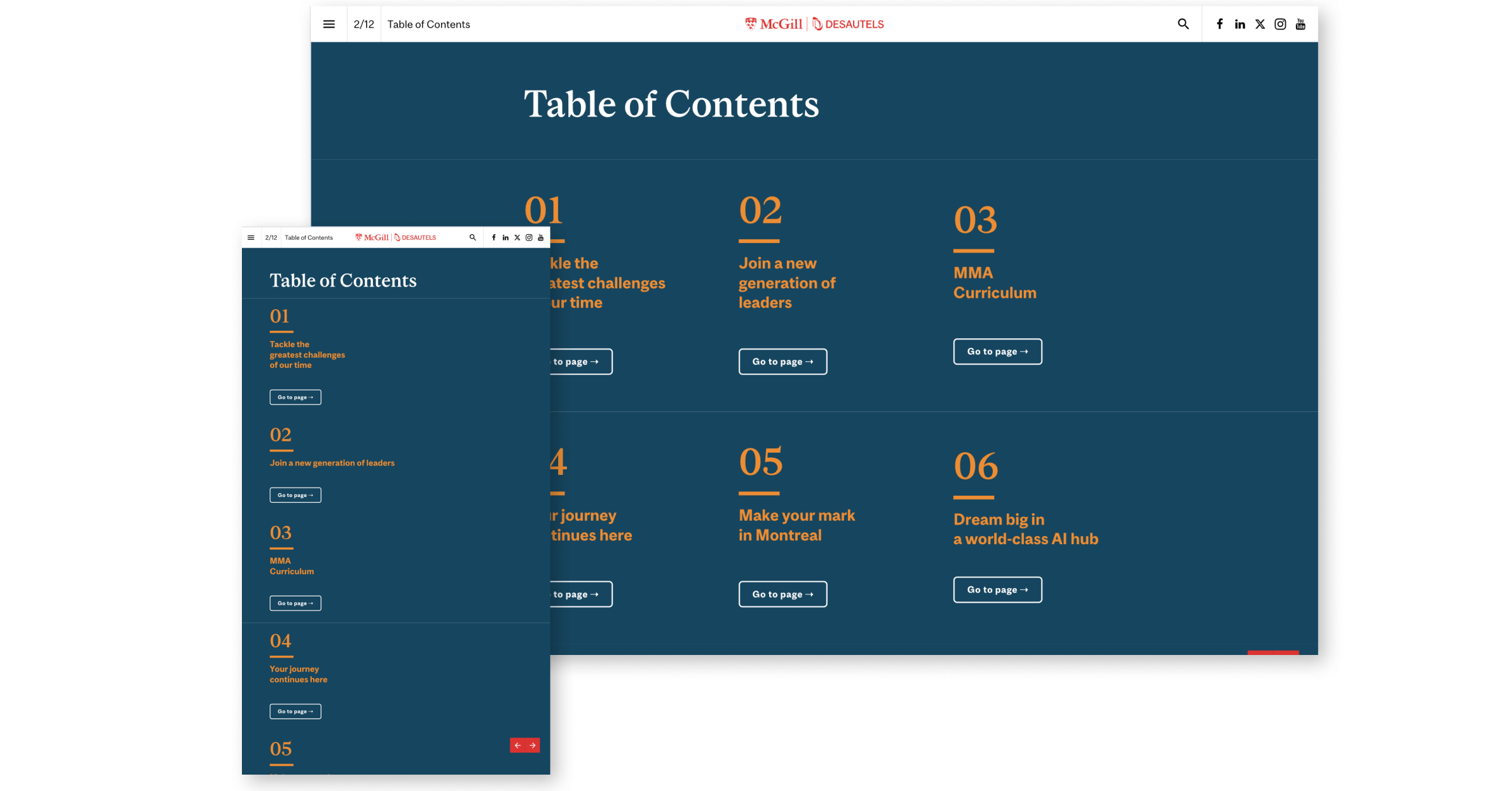
Easy navigation
Navigating a bustling city without a map would be disorienting. McGill's brochure avoids that confusion with a well-designed table of contents, making it easy to navigate through each page of the brochure. This user-friendly approach ensures your reader finds the information they need quickly, maximizing their understanding and maintaining content engagement.
Visual storytelling
Open the brochure and prepare to be visually engaged. Diverse student groups engaging in collaborative learning, cutting-edge laboratories buzzing with research activity, and professors leading stimulating lectures come to life through vibrant photography. The pictures act as narratives, transporting you directly into the dynamic McGill experience.
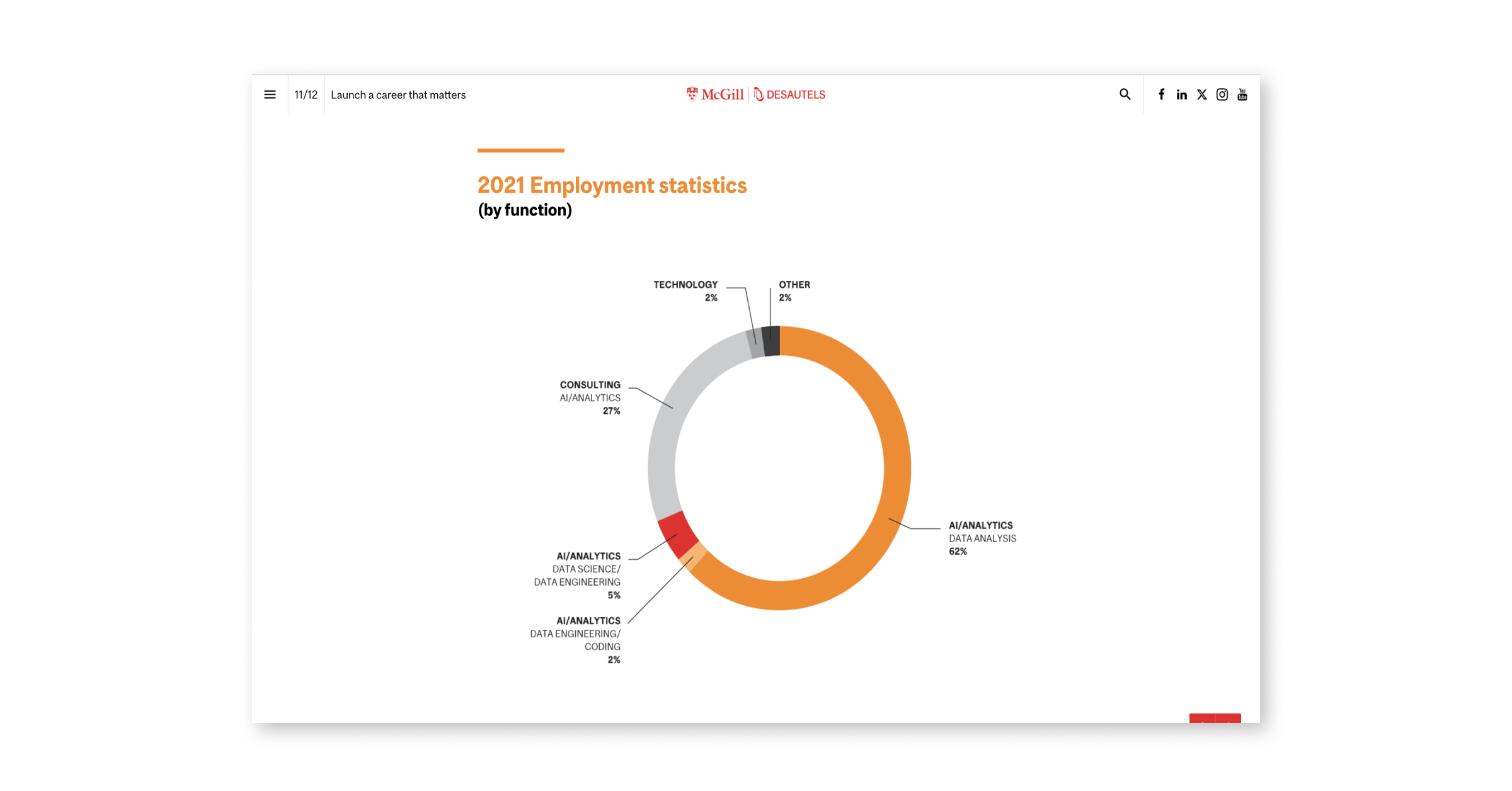
What would a brochure for an analytics master be without data? Clear and informative infographics further enhance the understanding of complex topics. And if a picture paints a thousand words, data paints a million more.
Personal stories and social proof
McGill's brochure empowers actual students to share their stories and motivations for choosing the program. Their candid testimonials and pictures create a relatable and approachable experience. This personal touch allows readers to envision themselves thriving in the program, not just reading about it. And don't underestimate the power of social proof: mentioning collaborations with renowned brands such as Allianz can establish credibility and inspire admiration.
Discover: 3 Ways to Overcome Higher Education Challenges
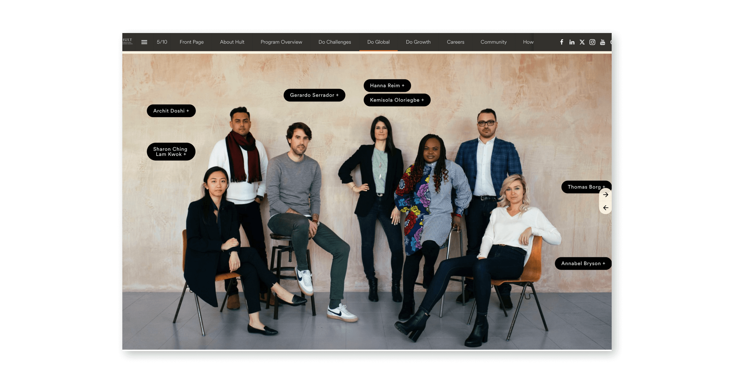
2. Hult International Business School's global one-year MBA program brochure
With campuses in London, San Francisco, Dubai, Shanghai, and Boston, Hult International Business School transcends borders to deliver a truly global MBA experience. Their Global One-Year MBA brochure reflects this spirit, introducing the reader to the program's unique features and diverse learning environments. Here's what makes it stand out among other brochure examples for students:
Interactive elements
On the first page, vibrant images take you to Hult's dynamic learning environment. Friendly headshots of professors and staff welcome you like familiar faces, instantly fostering a sense of belonging. Hult's brand colors and typography are seamlessly woven throughout the digital brochure, creating a cohesive and professional experience that reflects the institution's values.
Each page comes alive with captivating videos showcasing diverse aspects of the program and the vibrant campus life. The interactive map lets you virtually visit Hult's global campuses and experience the program's international reach. This brochure takes you beyond passive reading.
This interactive journey deepens the reader's understanding and ignites engagement, transforming the interactive brochure from informative to engaging.
Compelling content and design
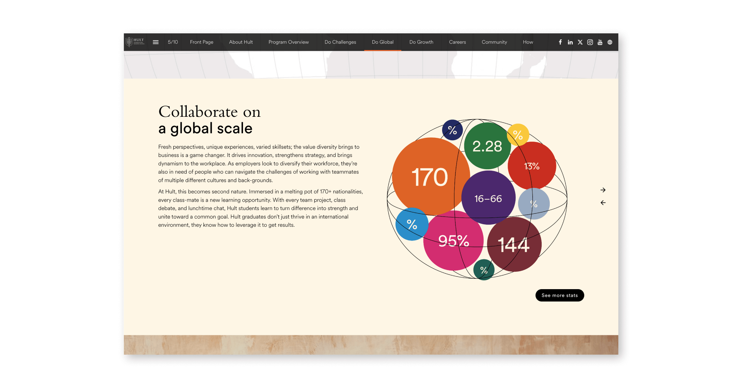
Beautifully designed infographics present key program statistics, making complex information clear, digestible, and visually delightful. Want to hear the human stories behind the numbers? This brochure features student and faculty staff testimonials, offering diverse perspectives and showcasing the program's impact on learners and educators. It's a refreshing twist that adds depth and relatability.
The brochure design actively guides the reader's journey. Strategic layout and information distribution work hand-in-hand, ensuring maximum comprehension and engagement. You'll never get lost in a maze of text — the brochure leads you through key points, ensuring you gain valuable insights without feeling overwhelmed.
Discover: How to Create and Format a Brochure
Clear navigation and responsive
No more aimlessly searching. The brochure template allows you to effortlessly find program details, campus spotlights, and success stories, shifting your focus from navigation to exploration.
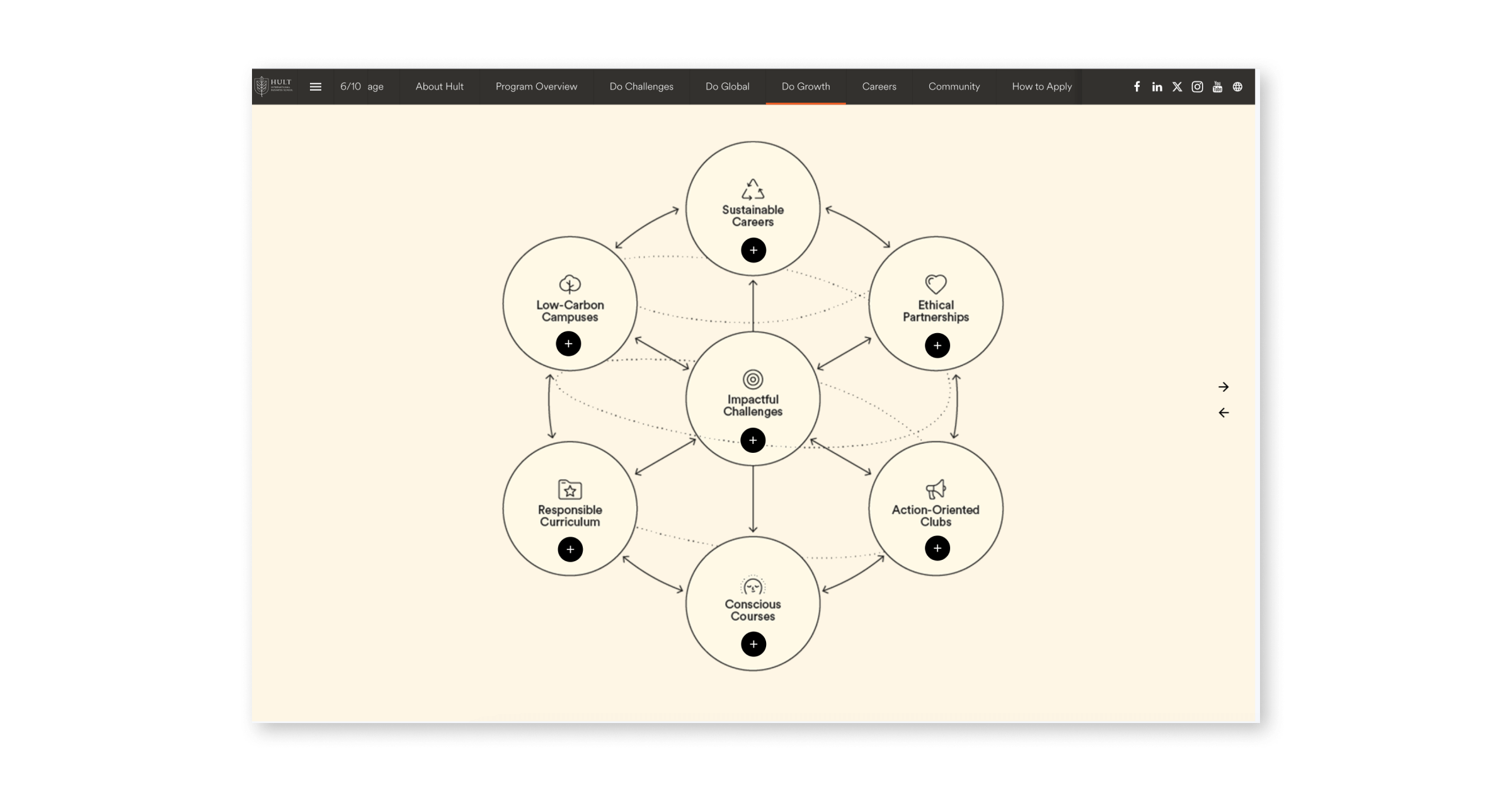
Interactive buttons give a deeper layer of information and make the brochure more engaging. Take the clickable staff picture, for example; it's easy to navigate and fun!
And the best part? You can take this interactive experience anywhere. The brochure is meticulously designed for mobile-friendliness, ensuring seamless access across all devices.
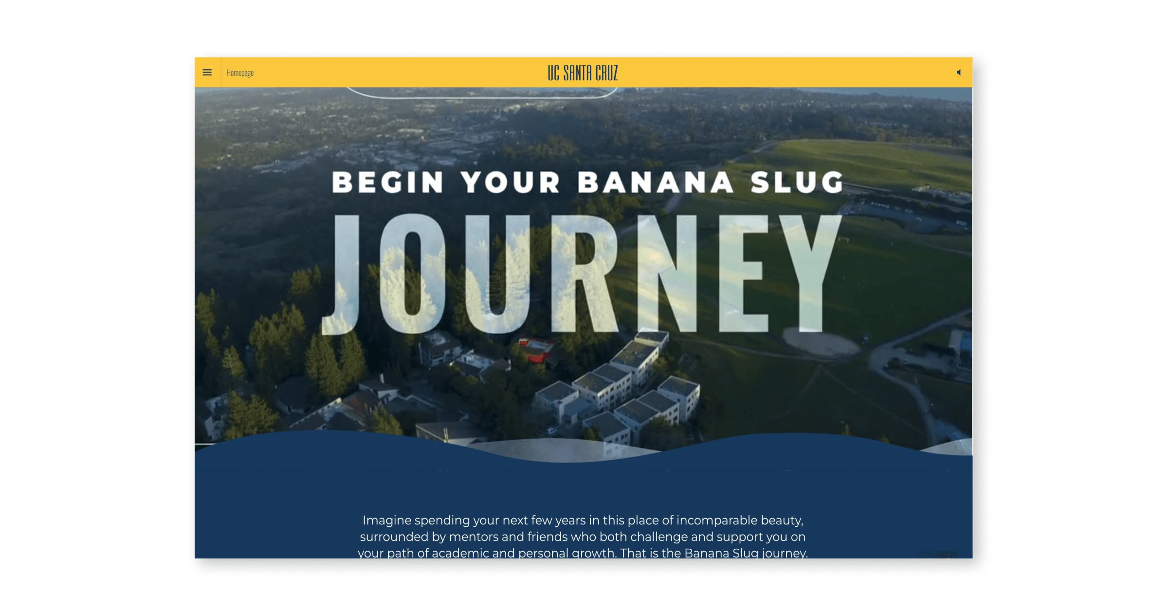
3. UC Santa Cruz's brochure
The University of California, Santa Cruz, perched between the Santa Cruz Mountains and the Pacific Ocean, displays a unique personality as vibrant and diverse as its landscape. Their captivating brochure perfectly captures this essence, inviting prospective students to learn and experience UC Santa Cruz.
Let's dive into the three key elements that make this brochure example stand out:
Identity lives in the design
If we say Santa Cruz, you say? That's right, beach. The vibrant blue and yellow color palette evokes the beachside spirit, and the quirky hand-drawn doodles sprinkled throughout add a touch of playfulness.
It's like flipping through a brochure that feels like a cool summer magazine — with the added benefit of interactive elements and digital access. The intro video immerses you in the university's setting, nestled between mountains and sea. This sets the tone for a visually engaging and informative design.
The brochure cleverly integrates interactive features like picture-linked copy and SoundCloud snippets, making it interactive. It's the perfect example of a design that doesn't sacrifice usability for style.
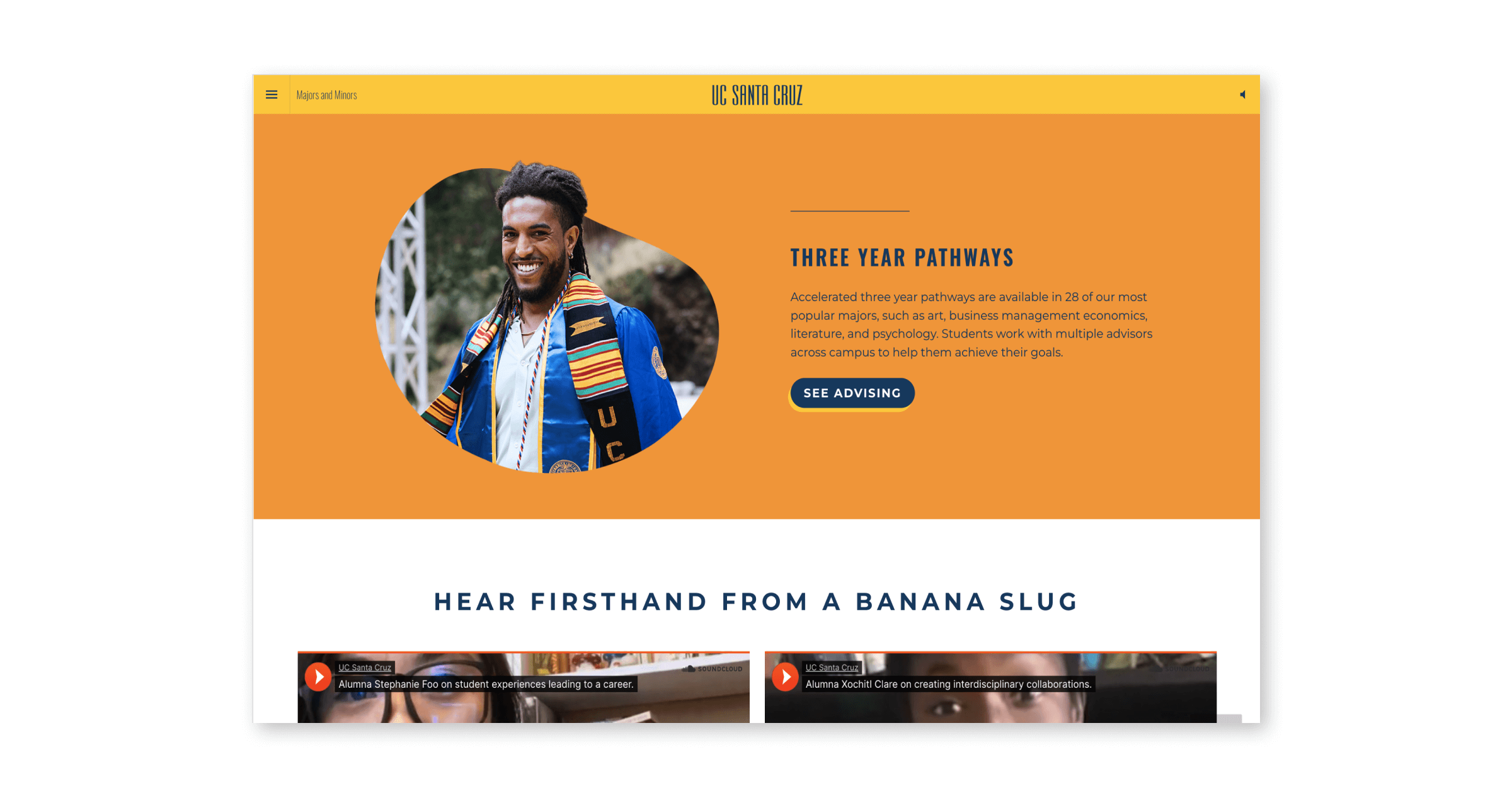
Stories that resonate
This brochure is a tapestry of real stories. You'll read about the university's history with captivating narrative and visuals. Meet staff members through their stories, brought to life with embedded sound clips and accompanying pictures. And what better way to showcase the university's impact than through real people? The brochure features inspiring success stories of alumni and current students, sharing their experiences and achievements.
This focus on authentic storytelling goes beyond social proof. It allows prospective students to connect with the university on a deeper level, envisioning themselves as a part of this community.
Authentic tone of voice
What truly sets this brochure apart is its distinctive voice. It's playful, approachable, and brimming with the same laid-back California charm that defines the university. From the Banana Slug mascot to the casual quotes from students and staff, the brochure feels like a genuine conversation rather than a formal presentation.
This authentic tone resonates with prospective students, especially those seeking a dynamic and welcoming environment. It breaks down the traditional barriers of university marketing, creating a space where students can feel comfortable and understood. The brochure embodies the UC Santa Cruz ethos — unique, inclusive, and full of life.
Conclusion
From beautiful visuals to interactive experiences, the captivating brochure examples for students of McGill, Hult, and UC Santa Cruz revealed a winning formula:
Clarity and ease: Information is easily accessible through intuitive navigation and responsiveness
Compelling storytelling: Real experiences like student journeys, faculty insights, and alumni success stories resonate deeply.
Unique identity and voice: Visuals and tone reflect their institutions' spirits.
Foleon Guide
Marketing Power Plays
Whether you're in content, comms, or demand gen, here are some novel tactics from Foleon’s Marketing team.


Anne is the Customer Content Marketer at Foleon. She loves chatting with customers and discovering the secrets behind their content. Anne's extensive experience in content creation fuels her genuine passion for all things content-related.
Want to write for the Foleon blog? Here's how to submit a guest post.


