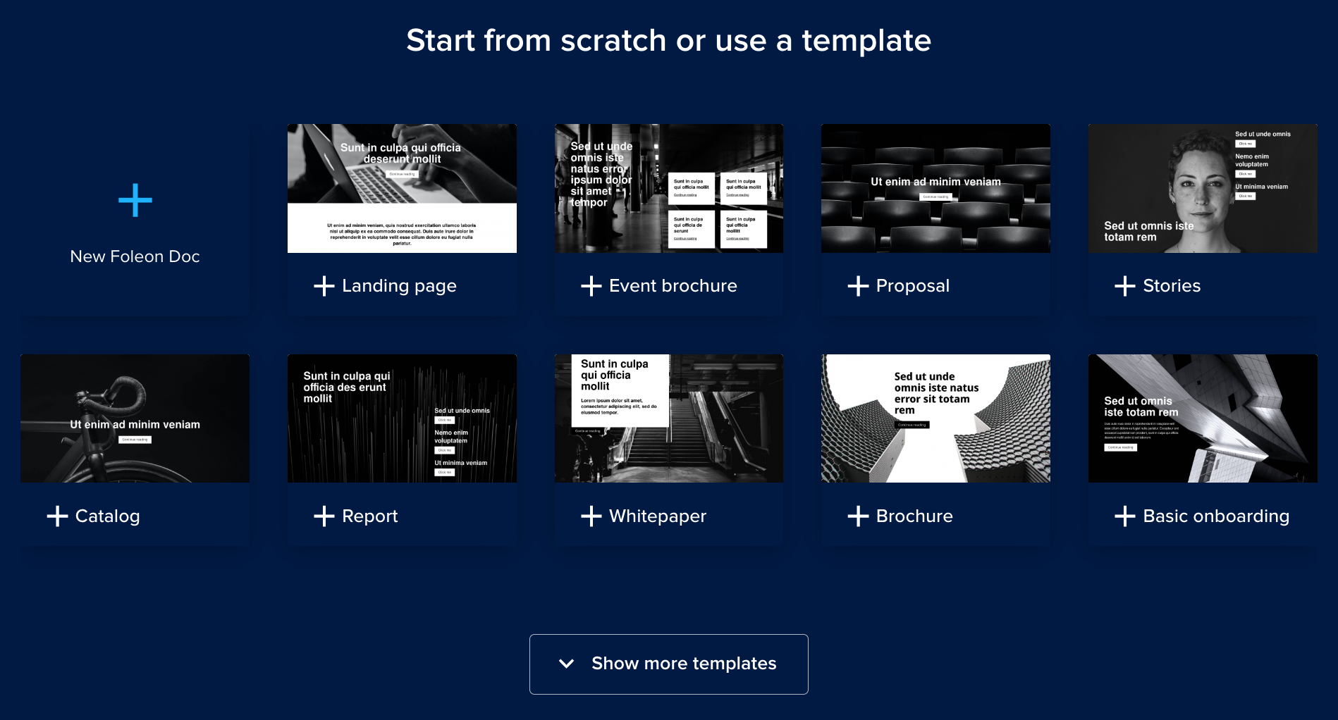
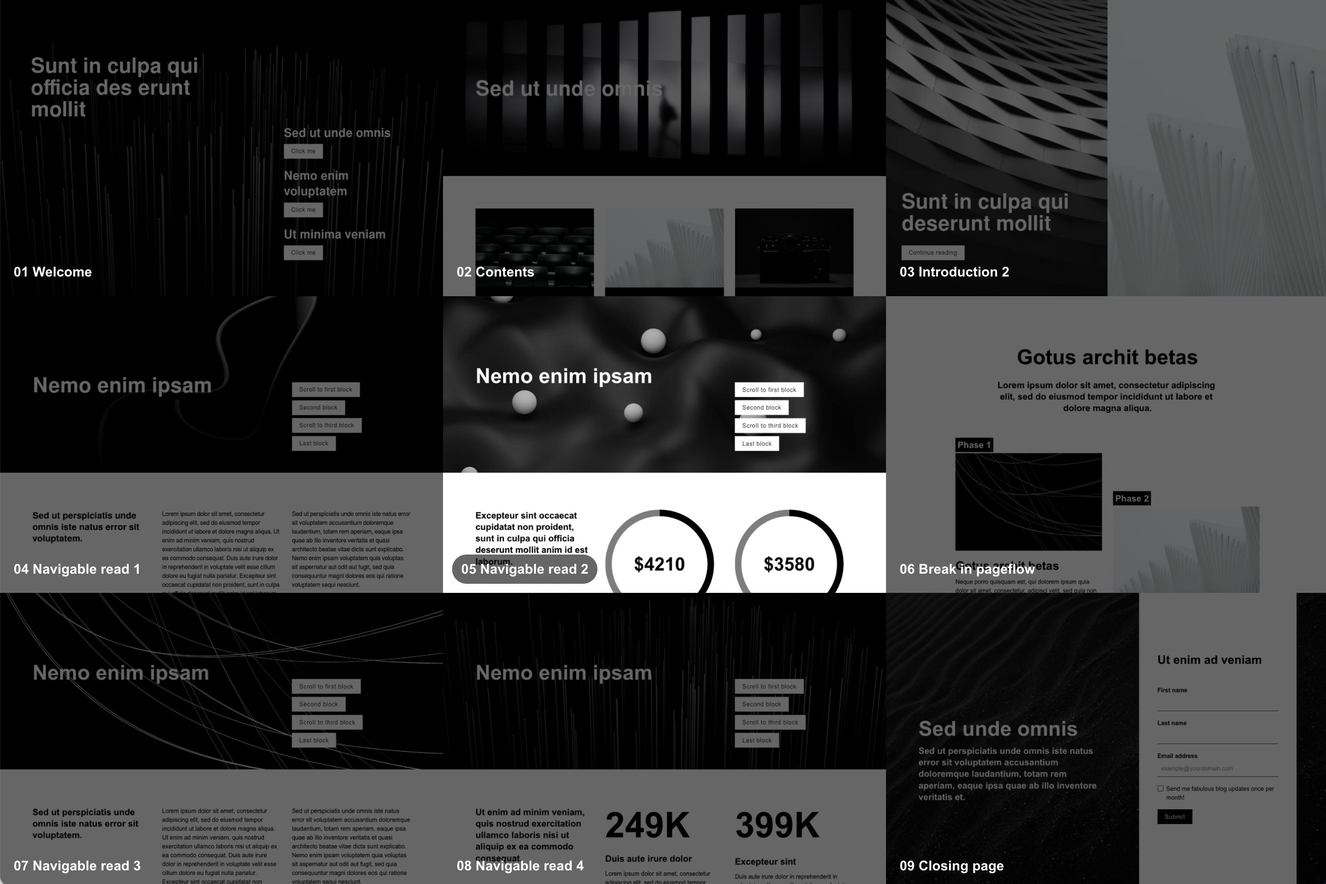
This month, we released a library of new templates to help Foleon users create stunning content faster than ever before.
A lot of thought and a considerable amount of work went into fine-tuning these templates in order to maximize both quality and speed.
Today, we sit down with Foleon’s Creative Director, Vincent van der Laan, to learn more about how our team approached these templates and how you can get the most out of them.
Hi, Vincent. In a nutshell, can you tell us what’s new?
Sure. We built a set of brand new templates from the ground up with the goal of making it easier for Foleon users to get from zero to a published Doc as quickly as possible.
There are forty-seven new page templates and thirteen new full Doc templates to play with. And more are on the way!
Not only do they represent a significant aesthetic upgrade, but the functionality in these templates has been drastically improved too. They incorporate all of Foleon’s latest features — things like data visualizations — and their settings have been streamlined and simplified.

All of the templates are also fully interchangeable, meaning you can mix and match all kinds of different blocks on the same page without worrying about introducing stylistic inconsistencies.
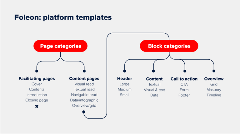
On top of that, the way we categorize templates has been altered to better match how we see customers creating content. It’s now much easier to find a layout suitable to your use case, which saves you time and helps you get the result you’re looking for.
So there’s quite a bit. The bottom line is that these new templates will help our customers get content out the door faster and in even more beautiful packages than before.
What are the primary ways customers will benefit from these new templates?
The first thing I would point out is speed and ease.
Because of the recategorization, it’s easier right off the bat to choose a template that’s suitable for what you intend to create.
If you think about it, the Doc template you choose in the beginning is a pretty significant decision in regards to how content will be structured and how the finished product will turn out. We’ve made that first important decision much more straightforward.
The streamlined settings are also a huge time saver. We’ve been highly consistent in how we applied default settings within the new templates. Now, rather than needing to adjust spacing on individual elements, for example, we’ve standardized these on the column level.
Of course, you can still customize things to your heart's desire. But if speed and efficiency are essential to you, you’ll find these streamlined default settings extremely helpful.

The second big thing is in regard to the look and feel.
Not only are these new templates prettier at first glance, but they’ve been created in such a way that they’ll continue to look nice after you’ve added all your own content.
And that was no easy feat! Because, of course, who cares if the template looks great? What users really care about is the quality of their finished product.
So we had to create structures and layouts that would work well in showcasing all the different kinds of content users might add. This requires a certain minimalist simplicity. How do we keep things clean and tidy so that users can build beautiful content on the canvases we provide? That was what we had to solve.
Tell us a bit about the design philosophy underpinning the new templates
Something we’ve done a bit differently this time around is to pay attention not only to our customers’ needs but also to the needs of their audience(s). In order to facilitate our customers’ success, we need to ensure they’re reaching their audiences in the right way.
Different readers consume content in different ways. And different types of content require different layouts and design approaches. An annual report, for example, will be (and should be) formatted quite differently than, say, a product catalog.
Tip: How to Create Annual Reports (with examples).

But not everyone knows how to do this well. There are a considerable number of variables and mistakes to be made. And most Foleon users don’t have a background in design.
So we set out to solve this problem. Both the design structure and categorization of our new templates are intended to help our users make the right editorial choices depending on what they’re creating.
And while we’ve made enormous strides, it’s also still a work in progress. In the future, I’d like to implement a sort of design wizard that will ask users a number of questions about what they’re creating and will then recommend specific layouts and navigation types. But that will have to wait for a future release!
—
If you’re already a Foleon user and want to try out the new templates you can go straight to the dashboard here. If you’re interested in getting started with Foleon, request a demo today!


