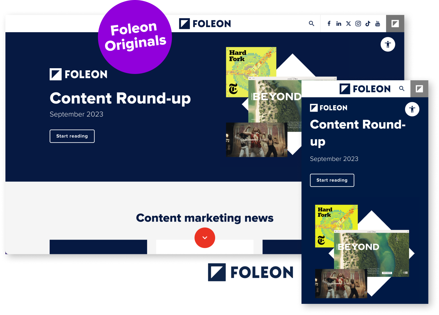
Remember back in the day when mobile-friendly content was all the rage? Well, now it's all about going mobile-first. What’s the difference, you ask?
Though they can cause confusion, moving towards mobile-first design means the paradigm has shifted. We’re no longer retrofitting content for desktops and attempting to make it responsive, but instead, designing for mobile devices first. In this blog, you can find out why UX professionals and developers are designing for mobile before desktop and why your content should follow suit.
The rise of responsive design
It was all the way back in the early ‘00s when developers started thinking about websites that could look good on many different screen sizes.
Words like fluid or flexible started to appear, and with the rising popularity of smartphones and tablets, the need for mobile-friendly design was becoming rampant.
Then, in 2010, Ethan Marcotte coined the term “Responsive Web Design,” paving the way for responsive design as we know it today.
Mobile-friendly vs. mobile-first: understanding the shift
The mobile-first approach is often confused with mobile-friendly, meaning the browser will compress the content to prevent overflow. Mobile-first involves designing for the smallest device and progressively enhancing the design features for larger screens and layouts. Though similar, they are indeed quite different.
The shift to mobile-first design is happening now as it prioritizes creating a seamless and engaging user experience specifically for mobile devices. It makes sense since, as of September 2023, 52.92% of webpages were viewed on mobile devices worldwide, according to Statcounter.
Why go for a mobile-first approach?
Mobile-first design is essential as it focuses on how users consume content, tailoring websites and applications specifically for mobile devices. This approach ensures a superior user experience on smartphones and tablets, which comprise most users.
For the developers and designers, opting for a mobile-first approach optimizes product design time. It enhances productivity by instilling a clear set of priorities, which guides designers to focus on the most crucial features and content. Starting with the constraints of mobile screens requires thoughtful decision-making, which results in a more streamlined and ultimately more efficient design process.
We’ve all experienced the frustration of pinching and swiping when trying to read a white paper PDF that is not optimized for mobile. This guide aims to make sure that never happens again.

Principles of mobile-first design
Prioritizing the user experience is the starting point. For guidance, here are five fundamentals of mobile-first design:
- Content priority: Prioritize and design content based on its importance and relevance to the user, ensuring the most vital information is prominently displayed on the mobile interface.
- Progressive enhancement: Begin with a basic, functional design for mobile devices and then progressively enhance the design and features for larger screens, ensuring a seamless user experience across all devices.
- Responsive design: Implement a fluid grid system and flexible layouts to create a design that adapts and scales smoothly to different screen sizes, from mobile to desktop, maintaining consistency and functionality.
- Performance optimization: Focus on optimizing performance for mobile devices by minimizing load times, reducing unnecessary elements, and using efficient code, ensuring a fast and responsive user experience.
- Touch-friendly interface: Design with touch interactions in mind, ensuring buttons, icons, and other interactive elements are adequately sized, spaced, and easy to tap on small screens, providing a user-friendly and intuitive experience for mobile users.
How to approach mobile-first content
Approaching mobile-first content involves tailoring your content strategy and creation process to prioritize mobile devices. Here's a step-by-step approach:
Understand your audience and goals: Identify your target audience and their mobile behavior. Define clear goals for your content and what you intend to achieve.
Prioritize and simplify content: Determine the most crucial information in your white paper and messages for mobile users. Simplify the content, keeping it concise, clear, and easily digestible on smaller screens.
Design mobile-optimized layouts: Work closely with designers to create appealing and functional layouts on mobile devices. Make sure whatever format or content creation platform you use lets you create responsive designs that adjust seamlessly to various screen sizes.
Optimize for performance: Compress images and optimize media to enhance loading speed on mobile devices. Minimize the use of large files in digital brochures that can slow down the webpage.
Incorporate SEO best practices: Optimize content for mobile search with relevant keywords and meta descriptions. You can improve your SEO rankings by ensuring mobile accessibility and fast loading times.
Test and iterate: Conduct thorough testing across various mobile devices to ensure the content displays correctly and is user-friendly. Leverage a platform that lets you gather feedback within the content to optimize and enhance your mobile content marketing strategy.
Discover: Stop Making These 4 Responsive Design Mistakes With Your Marketing Collateral
Embracing mobile-first design with Foleon
If you’re looking to create mobile-first or responsive content, then Foleon is an excellent solution.
With Foleon, you can create content for devices like desktops, mobile, and tablets without dealing with complicated tech stuff. You can keep things neat and hide or show specific content on each device. Plus, it helps make text look good on all screen sizes and helps manage the empty space (whitespace) well.
On top of that, Foleon makes it easy to resize and adjust images to fit just right. This makes Foleon incredibly handy for creating awesome stuff for mobile users.
Still not convinced? Learn how to leverage Foleon’s responsive design capabilities.

Get your content mobile-first ready
Mobile-first content is due to become the new standard practice in the evolving digital landscape. Anyone creating content for mobile users must gear up for this shift, ensuring your content is adaptive and optimized for mobile screens.
With Foleon by your side, the transition to mobile-first content becomes seamless. Stay ahead of the curve, embrace the future, and craft captivating mobile-first content that leaves a lasting impact with Foleon.

