You have undoubtedly heard the phrase, “Never judge a book by its cover.” Yet we, as humans, tend to make decisions based on aesthetics. It’s in our DNA. Literally. According to evolutionary psychology, 'judging a book by its cover' is an inherent human trait based on survival, so first impressions matter immensely.
Therefore, when designing a cover for your content, whether for an online magazine, interactive presentation, or social media post, a captivating cover page is vital for making an impression.
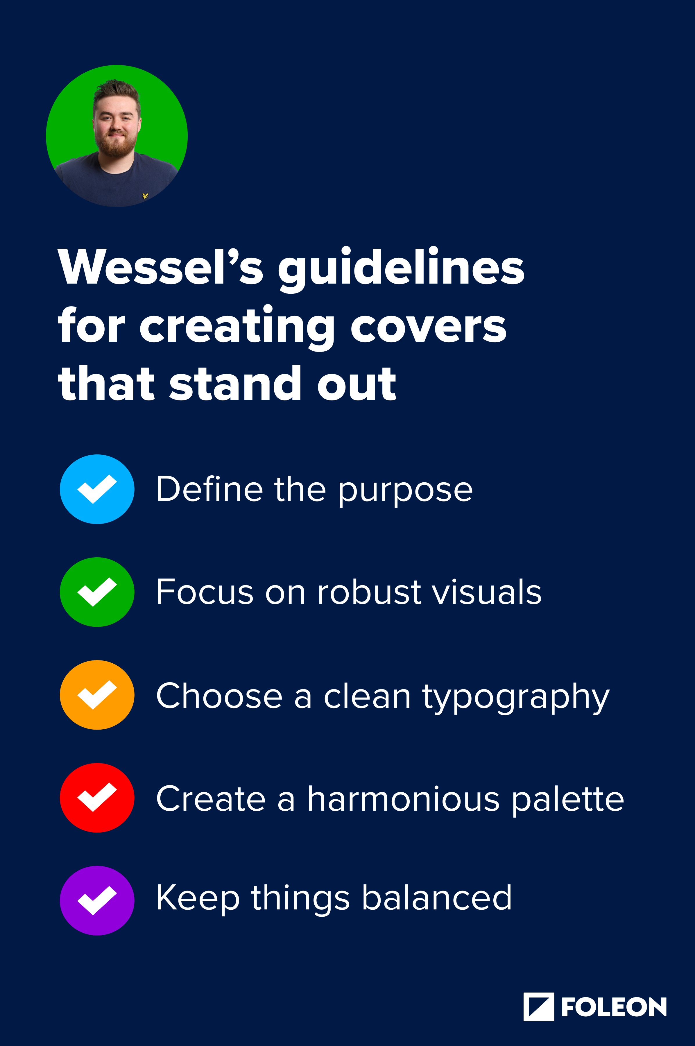
Wessel van Berkel, Digital Designer at Foleon, works closely with customers daily to educate and help them create engaging Docs. Here are his five essential guidelines to help you create stunning cover pages that grab readers' attention.
Why cover pages matter
When designing a piece of content, it can be easy to overlook the cover page and put all your design power into the bulk of the content. Cover pages are often seen as an afterthought, which is a big mistake.
You’ve probably heard the rule that, in general, you have about 8 seconds to grab someone's attention. New research shows that humans have a massive capacity for sustained attention. Not only that, but science shows that storytelling is an excellent tool for keeping people's attention. And whatever story you’re trying to tell starts with your cover page.
Whether or not your audience will read your story starts with an appealing cover page.
It sets the tone of your content. It hints at what your content is about and is the first thing your reader is confronted with. Also, a good cover shows professionalism, credibility, and impact. All things you want to make your content engaging.
What makes an attractive cover page?
Many elements come into play for something to be considered good design. There are twelve basic principles of design to consider: contrast, balance, emphasis, proportion, hierarchy, repetition, rhythm, pattern, white space, movement, variety, and unit.
Each principle is essential for determining your design, and it’s good to be aware of these principles and their function. For example, contrast adds visual interest, while balance ensures a harmonious distribution of elements. Emphasis directs the viewer's attention to key components, while white space provides breathing room.
You’ll determine the right balance of elements depending on what you want to showcase.
5 guidelines for creating covers that stand out
1. Define the purpose of your content and its intended audience
One of the most critical steps to creating stand-out cover pages is clearly defining the purpose of your content and the target audience. What are you creating, and who is it for? Ask yourself, 'What message do I want to convey?' and 'Who am I trying to reach?'
You must comprehensively understand the message you want to convey and the audience you want to reach. This is crucial for selecting the right colors, fonts, and imagery.
A cover for an alumni event brochure will look significantly different from a cover for an annual report. Be sure to tailor your design choices accordingly.
Read also: Creative Ideas to Turn Your Magazine Into Page-Turning Content
2. Focus on robust visuals
To create a compelling cover page, it's essential to include a vital visual element that aligns with the theme of your content.
Choose a visual element that grabs attention without overwhelming the viewer, whether a background video, a captivating image, or an eye-catching graphic.
You want to capture the readers' attention but not overwhelm them. Avoid using too many different types of visuals on the same page to maintain a clean and organized look.
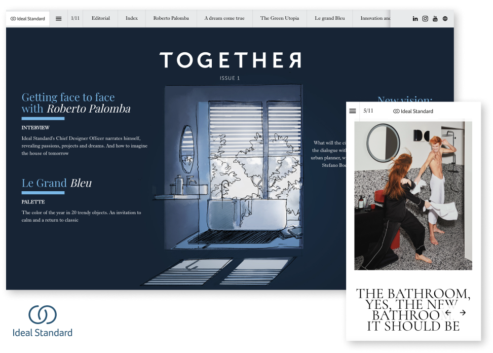
3. Choose a clean typography
Typography is one of the most essential elements in conveying emotion and is crucial in establishing a visual hierarchy.
Experiment with font pairings to create a balance between guiding the reader's attention and evoking the desired emotions. Avoid using too many fonts or overcrowding the page with text. In the example above, the font is more elegant but still clean and aesthetically pleasing. Check out the Foleon Doc by Ideal Standard.
Ensure that your typography aligns with your brand identity and effectively communicates your message to the reader.
4. Create a harmonious color palette
Like typography, color can evoke emotions and set the tone for your cover page. Use color theory principles like complementary or analogous colors to create visual interest and appeal.
Choose a harmonious color palette that aligns with your purpose, brand identity, and target audience. In the example below by Brikl, you’ll see a great example of a harmonious color palette. It’s a fantastic visual example of using many colors but ensuring they work together.
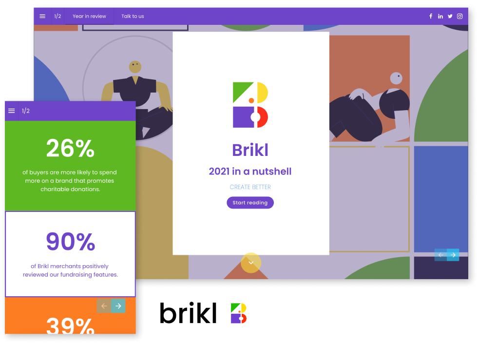
Top tip: Remember that different colors can convey different moods and associations, so select your colors carefully.
5. Keep things balanced
Achieving a well-balanced composition is crucial for an engaging cover page. Use compositional techniques like the rule of thirds to create visual hierarchy and balance.
Experiment with different layouts and arrangements until you find the perfect balance that captivates the viewer's attention. A balanced composition ensures that your cover page looks visually appealing and professional.
Now, let's take a look at some examples that apply these guidelines to create unique cover pages:
Example 1: Event cover page
When designing the cover page for an event, such as a music festival, like the example below, you want your audience to know exactly what you’re advertising.
This cover page is designed to grab attention and set the stage for an unforgettable concert experience. This example leverages video in the background to amplify the atmosphere of the live performance.
The creative and varied use of typography reflects the event's spirit, balancing excitement and readability.
-1.gif?width=600&height=333&name=ezgif.com-video-to-gif%20(2)-1.gif)
Example 2: Sales proposal cover page
Sales proposals are often less engaging, as it’s a standard format. In this example, the cover page aims to captivate readers immediately.
The clean look and feel set expectations for the rest of the document, while the visual elements, like the background and the time-sensitive gif, support the overall message and goal. Although bold and strict, the typography is complemented by a light color palette, making the sales proposal inviting.-1.gif?width=600&height=327&name=ezgif.com-video-to-gif%20(3)-1.gif)
Interested in more cover page examples? Check out this Foleon Doc!
Final words
Remember, never underestimate the power of a captivating cover page. It is the first impression your audience has of your content and sets the tone for their entire experience.
By following these five essential guidelines, you can create stunning cover pages that grab your readers' attention and leave a lasting impression on your audience.
Comparison Guide
PDFs vs Foleon Docs
Discover the modern format making PDFs obsolete.