
Corporate communications
Annual reports, ESG updates, and board decks with charts that reflect your brand — built in minutes, not days.


.svg)
.svg)
.svg)

DataViz lives inside Foleon. Build your chart, style it, drop it into your content — without switching tools or waiting on anyone else. Access it from the editor while you’re building, or from its own dedicated space in your dashboard.
One platform. No handoffs. No bottlenecks.

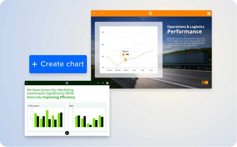
Every chart starts from your Brand Kit. Approved colors, fonts, and visual style are applied the moment you begin — not after three rounds of design review.
Running multiple brands or sub-brands? Charts adapt when you switch Brand Kits, so the same data works across divisions without looking like it was pasted in from somewhere else. No last-minute color corrections. No “can you make the blue match?” Slack messages.
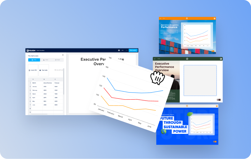
Charts aren’t disposable images — they’re managed assets. Save them, tag them, duplicate them, reuse them across content. Need the same structure in 12 client reports? Duplicate, update the data, publish.
When the numbers change next quarter, update the chart once and it refreshes everywhere. One edit. Every asset updated.

With the right plan, you can take your charts beyond Foleon Docs. Publish a chart and Foleon generates embed code you can use on your website, landing pages, or anywhere else that accepts embedded content.
Update the source chart in Foleon, and the change follows it everywhere — one source, published wherever it needs to go.
Annual reports, ESG updates, and board decks with charts that reflect your brand — built in minutes, not days.

Proposals and QBRs with polished data visuals that make your team look sharp and your numbers credible.

Thought leadership, campaign reports, and landing pages with data that’s part of the story — not bolted on from another tool.

Advisory reports, research summaries, and audit findings with charts your clients can trust.