![foleon_logo_white.png]](https://www.foleon.com/hs-fs/hubfs/foleon_logo_white.png?height=40&name=foleon_logo_white.png)
Buttons help guide your audience to specific content, giving you more control over navigation within your Foleon Doc. This article covers how to add a button, configure links, and customize styling.
💡 You can set the default button styling in the brand settings to ensure consistency across your Doc.
In this article
What is a button?
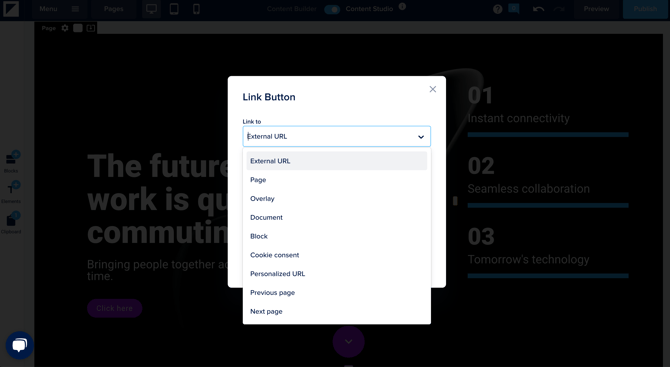
A button is an element that your readers can click on to navigate to the content you've configured. You can link a button to the following types of content:
- External URL - Direct a reader to a webpage outside of your Foleon Doc.
- Page - Link to another page in your Foleon Doc.
- Overlay - Link to an overlay to open a pop-up window.
- Document - Allow readers to view a file, such as a PDF.
- Block - Scroll to a specific section (block) on the same page.
- Cookie consent - Allow readers to open the cookie consent settings to manage their preferences.
- Personalized URL - Configure a personalized URL.
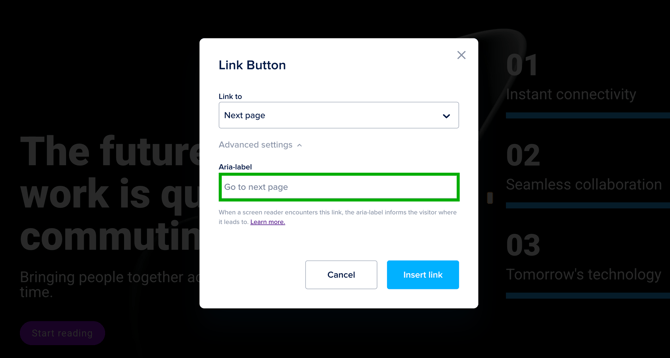
- Previous page - Link directly to the previous page in your Foleon Doc.
- Next page - Link directly to the next page in your Foleon Doc.
How to add a button
⚠️ When you're working with the Content Builder, you can't add buttons to your page. They're included in block templates.
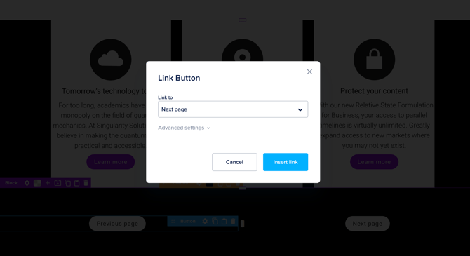
To add a button:
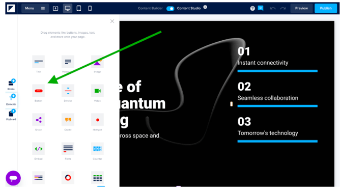
Open the elements tab. Drag and drop a button onto your page.
- External URL - Enter the URL. If you want the link to open in a new tab, check the box next to Open link in a new tab. Click Link to url to save.
- Page - Select the page you want to link to. Click Link to page to save.
- Overlay - Select an existing overlay from the dropdown list and click Link to overlay to save. Alternatively, create a new overlay.
- Document - Click Select a document. From the media library, you can choose an existing document or upload a new one. Click Link to document to save.
- Block - Click Select a block and then choose the block to link to on your page.
- Cookie consent - Click Link to save. Be sure to enable cookie consent in your Doc settings.
- Personalized URL - Select the property from the dropdown. Uncheck the box next to Use this property's default value to customize the default link. Read more about personalizing with URL properties here.
- Previous page - Click Insert link to save.
- Next page - Click Insert link to save.
📖 Learn more about accessibility: A guide to accessible content
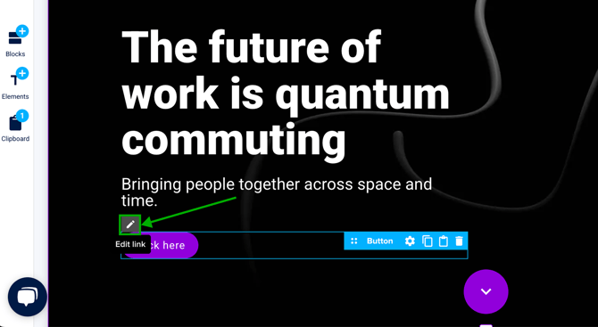
To edit a link, select the button on your page and click the pencil icon to Edit link. The pop-up will reopen, allowing you to make any changes.
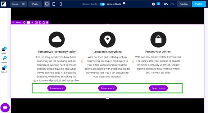
Add multiple buttons in one row
You can add multiple buttons to the button element, allowing you to place buttons side by side.
To add multiple buttons:
- Hover over the button element on your page
- Click the + icon within the element to add a new button to the same row
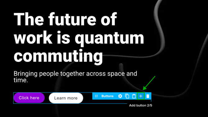
💡 You can add up to five buttons in a single row
Styling behavior:
- The first button inherits styling from Button 1 in your brand settings
- Every additional button uses the styling from Button 2
- You can adjust the settings to style each button individually
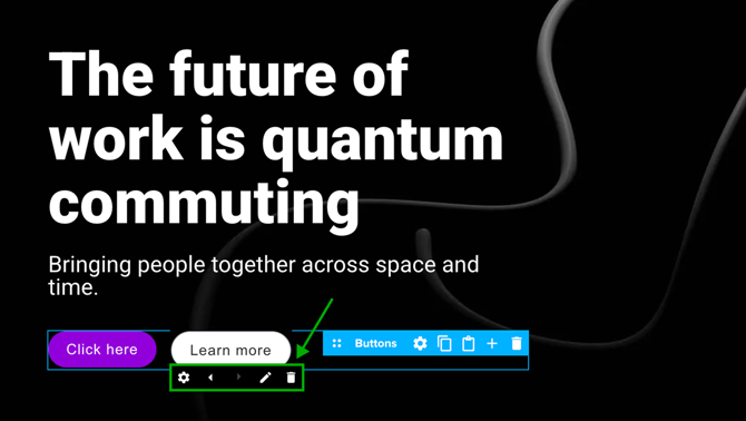
Edit individual buttons:
Hover over any button to reveal the following options:
- Adjust the settings
- Move the button left or right
- Edit the link
- Delete
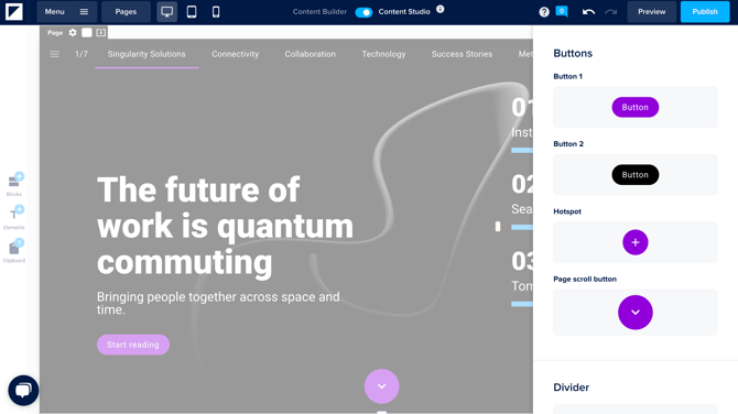
Styling a button in the brand settings
You can set a default style for all buttons in your Foleon Doc in the brand settings. Changes here automatically apply to all buttons, unless a button has already been customized.
💡 You can modify the element settings on any button. This allows you to customize individual buttons, overriding the default brand style.
To set a default style for your buttons in the brand settings:
- Open the Menu and select Brand
- Scroll down to Buttons
- Set the styling for Button 1 and Button 2. You can adjust the following element settings: general settings (to create a full-width button), background, border, shadow, or spacing.
-
Button 1: This is your primary button. Click the button under "Button 1" to set the style.
-
Button 2: This is your secondary button. Click the button under "Button 2" to set the style.
-
💡 You can also adjust the 'Hover' state, allowing you to style how the button looks when a reader hovers over it. This is also known as the "mouse-over" effect.
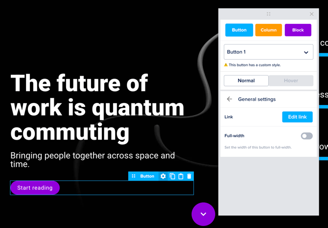
Element settings
In the settings, you can customize the style of your buttons.
If you only have one button in your button element, click the blue ⚙️ cogwheel icon on the button element to access all settings explained below.
If you have multiple buttons in a button element, you can adjust each button individually or configure the layout for the entire row.
- To edit an individual button: Hover over the button and click the ⚙️ cogwheel icon on the button to access its settings.
- Adjust the general settings (button link and full-width settings)
- Background
- Border
- Shadow
- Animation
- To edit the entire button element: Click the blue ⚙️ cogwheel icon on the element. These settings let you manage:
- Spacing
- Alignment
- Visibility
- Animation
⚠️ When you're working with the Content Builder, element settings are limited. You can duplicate, add, or delete buttons, allowing you to create a layout such as a contents page.
💡 You can adjust the 'Hover' state, allowing you to style how the button looks when a reader hovers over it. This is also known as the "mouse-over" effect.
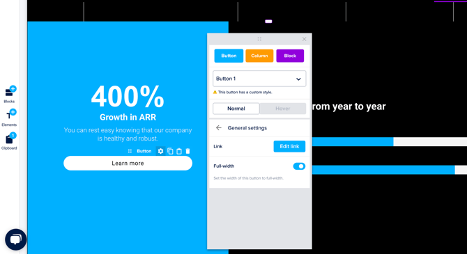
General settings
You can perform two actions in the general settings:
- Edit link: Click Edit link to update the linked content.
- Full-width: Turn the toggle on to create a full-width button.
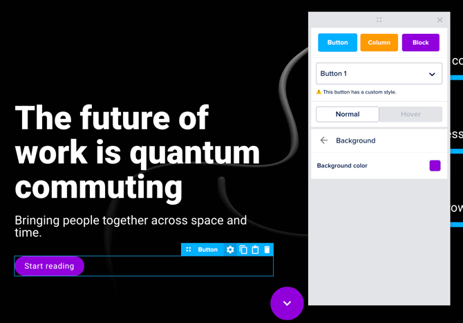
Background
Set the background color of the button using the color picker.
💡 You can also set a background for the hover state.
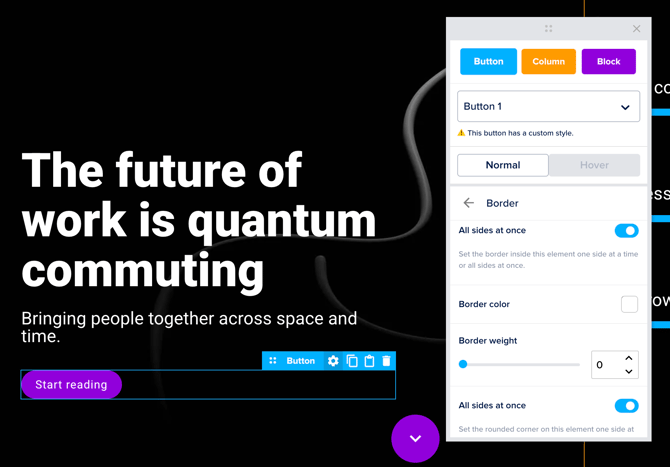
Border
Customize the border of your button:
- Choose the Border color from the color picker
- Set the Border weight
- Set the corner radius under Rounded corners
By default, All sides at once is toggled on. This means you will set the same styling for all sides of your button. To customize each side individually, toggle this option off and adjust the border settings for each side. The border color you select will apply to all sides.
💡 You can also set a border for the hover state.
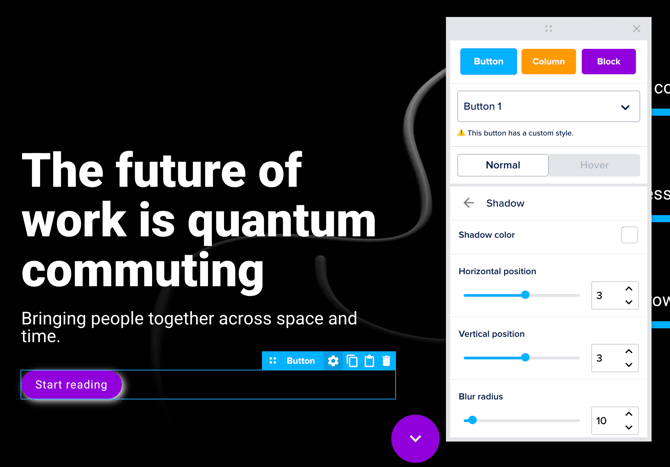
Shadow
Add a shadow effect to your button element:
- Choose the Shadow color with the color picker.
- Adjust the Horizontal and Vertical positions to set the distance between the shadow and the button.
- Adjust the Blur radius to blur the shadow.
💡 You can also set a shadow for the hover state.
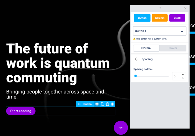
Spacing
Increase the bottom spacing to create more space below your button.
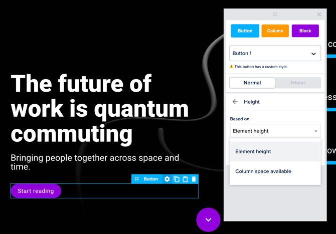
Height
Adjust the height of the element by selecting one of the options from the dropdown:
- Element height: The element height will be equal to the height of the button.
- Column space available: The element height will automatically adjust to match the available height in the column.
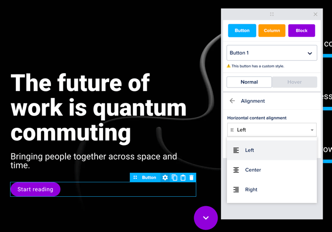
Alignment
Adjust the horizontal alignment of the button within the element. You can align the button to the left, center, or right.
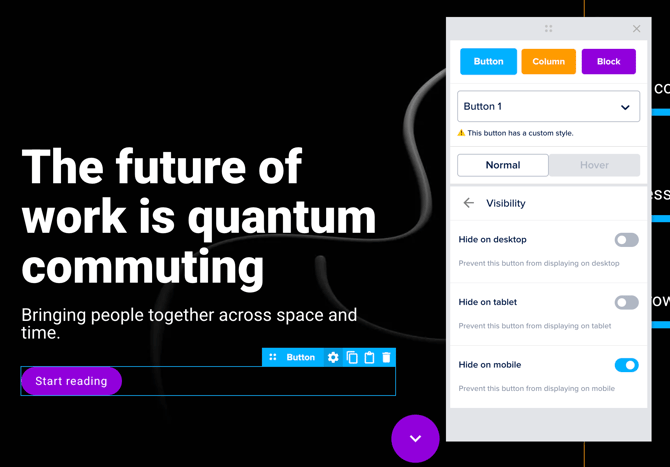
Visibility
Choose to hide the button on desktop, tablet, or mobile devices. This allows you to show certain elements on desktop but hide them on mobile, or the other way around.
Animation
Choose an entrance animation from the drop-down menu. This animation will show once when the page is opened.

Tips & Best Practices
Follow the tips below to improve readability and navigation on your Foleon Doc using buttons.
Create a full-width button
You can adjust the width of your button so it takes up the full width of the column. This improves visibility, makes your call to action more noticeable, and ensures better alignment across layouts.
To create a full-width button:
- Open the button settings
- Click on general settings
- Toggle Full-width on
Link directly to the previous or next page
You can add buttons that link directly to the previous or next page so users can easily navigate from page to page. By linking your button to the previous or next page, you don't need to worry about updating links if you reorder pages later. We recommend setting up previous/next page linking when adding navigation links in a footer.
To link to the previous or next pages, choose the options Next page or Previous page in the dropdown when configuring the link.
Align buttons horizontally
The element height setting allows you to create consistent card-like layouts by aligning buttons horizontally across columns. This layout is useful for pages that include designs for a product catalog or meet the team section.
📚 Learn how to align buttons horizontally in our article: Align elements horizontally with height