![foleon_logo_white.png]](https://www.foleon.com/hs-fs/hubfs/foleon_logo_white.png?height=40&name=foleon_logo_white.png)
An overlay is a pop-up that displays additional information without disrupting your pages. In this article, you'll learn how to add and manage overlays.
💡 Overlays are part of our Foleon glossary.
What is an overlay?
An overlay is a pop-up screen linked to a button, hotspot, image, or text. It can be used to add additional information to a page without creating extra clutter.
When a viewer opens an overlay, they can return to the main page by closing the X icon or simply clicking outside the overlay.
💡If you're using the search function in your navigation, keep in mind that the results won't include text from overlays.

How to create an overlay
There are two ways to create overlays. You can create an overlay when you add a button or hotspot to the page. Here you can choose to link to an overlay, and the option to create a new overlay appears.
When creating a new overlay, you can either start from scratch or use one of the preset templates.

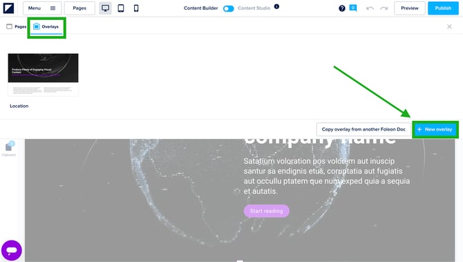
Another way to create a new overlay is in overlay management. First, click pages in the top left corner of the screen. Below you will then be able to see the overlays option.
Click +New overlay to create a new overlay. Here you can also choose to start from scratch or use one of our templates.
💡When you're working with the Content Builder, it's not possible to add individual elements to your overlay. Instead, quickly build your overlay using one of the overlay templates. Starting from scratch? Drag block templates into your overlay.
Want to add the social share element to your overlay? Keep in mind it will share the page from which the overlay opens, not the overlay itself.
Copy overlay from another Foleon Doc
If you want to insert overlays from other Foleon Docs into your current Doc, click the copy overlay from another Foleon Doc button.
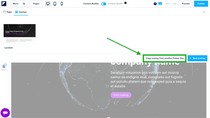
This will prompt you with a selection screen. Here, you can either navigate through your projects and their corresponding Foleon Docs or open a complete overview of all your Docs, regardless of the project they’re in.
When you’ve found the relevant Foleon Doc, select the overlay(s) you want to insert and click insert.
How to edit an overlay
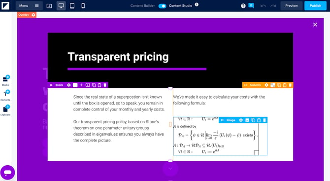
Editing an overlay is very similar to editing a page. In overlay management, click the overlay you'd like to edit. You can add blocks, columns, and elements.
The only difference will be the overlay background that allows you to determine the background behind the overlay.
💡When you're working with the Content Builder, it's not possible to add individual elements to your overlay. Instead, quickly build your overlay using one of the overlay templates. Starting from scratch? Drag block templates into your overlay.
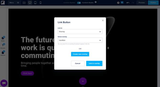
Linking to overlays
You can link to an overlay from a button, hotspot, image, or text. In the general settings of these elements, you can select edit link to create the link to the overlay.
💡 Multiple buttons, hotspots, and images can be linked to the same overlay. This means there is no need to make copies of the same overlay.
To make it clear for your audience how to return to a page from an overlay, we recommend adding a "Go back" button as a footer. In the video below, we show you how to do that.
Good to know: it's not possible to link to a specific block on a page from an overlay.
⚠️ When you link your overlay back to the page (e.g., page 5) your reader came from, make sure you're on another page (e.g., page 6) when you link the button. If page 5 is your active page in the editor on which you're editing the overlay, the option to link will be greyed out.
Managing overlays
The overlays that are in use can be managed in overlay management. First, click pages in the top left corner of the screen. Below you will then see the overlays option. When you hover over an overlay, you will see 3 options.
Save as template
You can save overlays as templates so you can reuse them in your Foleon Docs. Templates will help you to save time and stay on-brand. Read all about it in our article Save time and stay on-brand with templates.

Duplicate
When you hover over an overlay, you will see the option duplicate. With this option, you can create a copy of that overlay. Keep in mind that it could take a few seconds before the new page is visible in the overview.
💡 The word “Copy” will be added at the end of a duplicated overlay, because every overlay name needs to be unique.

Delete
When hovering over an overlay, you’ll find an option to delete that overlay. When you click the trash icon, you’ll be asked if you are sure you want to delete the overlay. When you click delete, the overlay gets deleted permanently. There is no option to retrieve it after it has been deleted
💡 It is not possible to delete an overlay you’re currently on. First, move to a different overlay and then try again.

Overlay settings
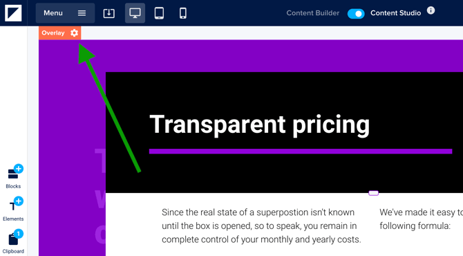
Every overlay has its own settings. They can be edited by going to the top left corner of the overlay and clicking on the cogwheel icon in the red bar.
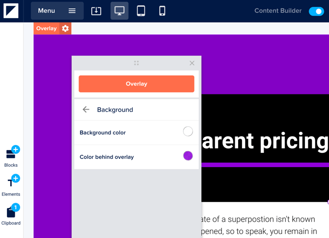
Background
In background, you can set a background color to the overlay and determine the color behind the overlay. This is grey with a transparency of 30 by default. You can choose any color or transparency.
💡 When you want the overlay to optically look smaller, you can set the background color of the overlay and the background color of the block in the overlay to transparent. That way, you can choose to only give the background of the column a color so that the overlay looks smaller.
Border
The border option allows you to create a full border or a border on specific sides of your overlay. All sides at once is selected by default, which means that when you increase the border thickness, the same amount of border will appear on all sides at the same time.
When all sides at once is deselected, the option to increase the amount of the border for each side will appear. It is also possible to add more than one border. Every border will have the same color that is selected at the border color picker.

Shadow
You can add a shadow to your overlay. Choose the shadow color with the color picker. After selecting the color you can choose the horizontal position and vertical position. The blur radius can be used to make the shadow less harsh and a bit more faded.

Close icon
Here you can change the color of the close button ("X") in the top right corner of the overlay pop-up. Your audience will be able to click it to close the overlay and return to the page.
💡 Viewers can also click outside the overlay to close it — they don’t need to use the X icon. This works in the editor, preview, and live versions of your Doc.
⚠️ Don’t set the color of the close icon to white when the overlay background is white too. On mobile, the reader won’t be able to see the icon.
Related articles