![foleon_logo_white.png]](https://www.foleon.com/hs-fs/hubfs/foleon_logo_white.png?height=40&name=foleon_logo_white.png)
In this article
Basics: colors & fonts
Navigation: logos, navigation bar, page arrows, & page scroll
Content: color modes, font styles, buttons, divider, data elements, forms, cards, & cookie consent
📖 Want to apply a Brand Kit to your Doc? Learn how here: Apply a Brand Kit to a Foleon Doc
Accessing the brand settings
There are two places you can access the brand settings:
- When creating a Brand Kit: Set default styling with a Brand Kit and apply it across multiple Docs for consistent designs.
- When editing the Brand Settings of an individual Doc: You can also manually adjust the brand settings of each Doc individually.
To open the brand settings in a Foleon Doc, click Menu in the top-left corner of the editor, then choose Brand. This panel allows you to define the styles that apply throughout your Foleon Doc.
- If a Brand Kit is applied to your Doc, the brand settings will match the styles you've set in your Brand Kit.
- If no Brand Kit is applied, your new Doc will inherit the brand settings from the last Doc created in that workspace.
💡 We recommend applying a Brand Kit before adding pages, blocks, or elements so your design is applied consistently from the start.

Brand settings will automatically apply to new content in your Doc.
You can set styling for specific elements for tablet and mobile view modes in your brand settings.
- When you update these elements while in the desktop view mode, the changes apply to desktop, tablet, and mobile views.
- When you update them in the tablet view mode, the changes apply to both tablet and mobile views.
- When you update them in the mobile view mode, the changes apply to mobile view only.

When are Brand Kit settings overridden?
After you've set the brand settings — or applied a Brand Kit — the styling will automatically apply to any new elements you add to the page.
You can still manually style individual elements.
⚠️ Manual styling breaks the link to your Brand Settings
If you manually edit an element's style, it will no longer follow the Brand Settings or Brand Kit applied to the Doc. This means that if you later update the brand settings or apply a new Brand Kit, that element will not update automatically and will keep the custom styling you applied.
All Brand Settings Explained
Below is a breakdown of all the elements you can style — either when building a Brand Kit or in the brand settings for each Doc.
The Brand Settings are broken down into three tabs:
- Basics: Style basic elements such as colors, page background, and custom fonts
- Navigation: Style your navigation elements such as logos, navigation bar, page arrows, and page scroll button.
- Content: Set your color modes and style each element, such as header and paragraph fonts, buttons, dividers, data elements, and cookie consent.
Click on each tab to adjust the styles individually.

Basics
Colors
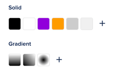
In the Colors section, set your default color swatches for quick access throughout your Doc. This helps maintain visual consistency and saves time entering hex codes.
Custom fonts
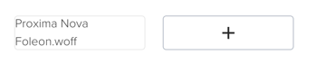
Click the + icon to open the font library, which allows you to add custom fonts. You can find all the Google fonts here or upload your own custom fonts.
📖 Learn more in our article All about fonts

Navigation
Logos
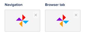
Set logos for the navigation bar and the icon for the browser tab — also known as favicon.
-
Navigation bar: We recommend setting the height of your navigation logo to 57px so it matches the height of the navigation bar. A rectangular logo in landscape orientation fits best. The optimal image format is SVG because it auto-scales. If you can, add some white space to the bottom and top of your logo, as the logo container in the navigation bar doesn't have margins.
-
Browser tab: The optimal size for creating a favicon is 16x16 pixels, the size in which they are most commonly displayed. However, they can sometimes appear in larger dimensions too (such as 32x32 pixels)
Navigation bar
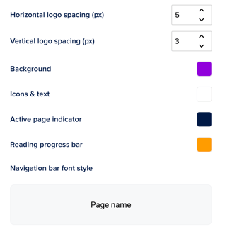
- Horizontal logo spacing (px): Add padding on the left and right of the logo
- Vertical logo spacing (px): Add more padding above and below to control how big your logo is displayed in the navigation bar. The more space you add, the smaller your logo will appear.
⚠️ When page names are disabled in the Doc settings, the logo is centered — so the horizontal spacing setting doesn’t apply. The logo is also centered in mobile view, so you cannot set the horizontal spacing for this view mode.
-
Background: Set the color for the background of the navigation bar
-
Icons & Text: Set the color for the icons and text in the navigation bar
-
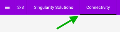
Active page indicator: Set a color to underline the active page to show the reader which page they're on. Disable active page name in the Foleon Doc settings if you prefer this not to be visible — e.g., when you only want a logo in the navigation bar.
- Reading progress bar: Set a color for the reading progress bar, which you can enable in the Foleon Doc settings.
-
Navigation bar font style: Set the font for the text in the navigation bar. Click on the text Page name to adjust the text settings.
Page arrows
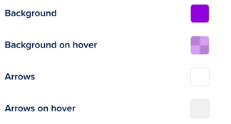
Page arrows let your audience navigate between pages. You can style the following options:
- Background: Set the background color for the page navigation arrows.
- Background on hover: Set the background color for the hover state (when a user hovers over the arrow with their cursor)
- Arrows: Set the arrow color for the page navigation arrows
- Arrows on hover: Set the arrow color for the hover state (when a user hovers over the arrow with their cursor)

Page scroll button
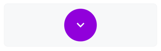
Click on the button to open the settings. Here, you can adjust the style of your page scroll button, such as the icon, background, border, shadow, spacing, and alignment.
Content
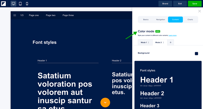
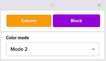
Color Modes
With Color Modes, you can pre-define how your brand colors adapt across different contexts — light or dark backgrounds, high-contrast layouts, or campaign-specific themes. Instead of manually adjusting colors block by block, you apply a mode with a single click and everything updates automatically.
💡 Color Modes are configured in the Brand Kit and applied to blocks, columns, and elements in your Docs.
Create a Color Mode
- Click the + button next to the mode tabs to add a new mode.
- Set a background color for this mode.
- With the mode active, manually adjust the styling for fonts, buttons, dividers, data elements, forms, cards, and cookie consent. Any changes you make will be saved specifically to that mode.
- Use the kebab menu (⋮) on each tab to rename, duplicate, or delete a Color Mode.
💡 Once your modes are created, they become available when editing a Doc. Color Modes can only be edited in the Brand Kit, not from within a Doc.
💡 You can create up to 5 color modes
⚠️ Mode 1 is your default mode and cannot be removed.
Apply a Color Mode to your content
Once you've created your Color Modes in the Brand Kit, you can apply them to blocks, columns, and elements in your Doc.
- Select a supported element, such as a block, column, card, button, text, form, hotspot, or divider.
- In the settings panel, open the Color Mode dropdown.
- Select your desired mode.
💡 You don't need to set a mode on every individual element. If a block or column has a mode applied, all supported elements inside it will follow that mode automatically.
⚠️ Color Modes are not supported on image elements, social icons, tables, and charts. These will retain their existing styling regardless of the mode applied.
How Color Modes behave
-
Modes override inline styling
When you apply a mode to an element, any manual color overrides on that element are automatically removed so the mode's colors take effect. If you apply a mode to a block or column, all supported elements inside it — text, buttons, dividers — will switch to that mode's colors. -
Modes work across levels
You can mix modes at different levels. For example, if you want a specific Light card inside a Dark block, set the card's mode manually. The block's mode will no longer control that card — the card-level setting takes priority. -
Inline styling after a mode is applied
Applying a mode doesn't lock your styling permanently. You can still make manual adjustments after — for example, changing a button color within a Dark mode section. Your manual change will stick unless you re-apply the mode to that element later.
Font styles

When you click on a font style, the text editor bar will appear at the top of your screen. From there, you can change the font and style it to your liking. Adjust the font, color, size, styling, line & paragraph spacing, and capitalization. You can configure the following styles:
-
Headers: Set the different levels for headers in your content (H1, H2, H3, H4)
-
Paragraph: Set the font styling for the main paragraph text in your content
-
Text link: Style the text links in your Foleon Doc
-
Quote: Set the font styling for quotes in your content
-
Numbered list: Set the font styling for numbered lists in your content
-
Bulleted list: Set the font styling for bulleted lists in your content
-
Table header: Set a default font style for a table header
- Table cell: Set a default font style for a table cell
Buttons
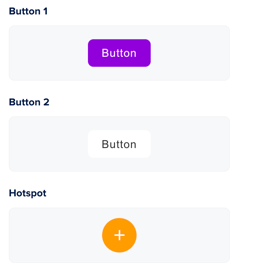
Define the default styles for different button types:
-
Button 1: Set the style of your primary button
-
Button 2: Set the style of your secondary/alternative button
-
Hotspot: Set the appearance of the interactive hotspots in your content
Clicking on the button will open the settings where you can adjust the styles.
Divider
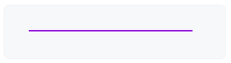
Click on the button to open the settings. Here, you can adjust the style of your divider, such as the color, weight, spacing, and shadow.
Data elements
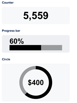
Data elements give you the option to visually represent data. These include a counter element that counts up to a specified value, a bar element that progresses to a given value, and a circle element in the form of a donut chart
Click on each element to set the style. You can adjust the default settings, such as colors, background, spacing, and animation.
Forms
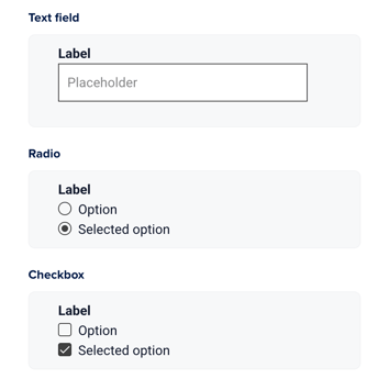
You can define the styling for elements in your form, such as text fields, radio buttons, and checkboxes. Click on each component to customize colors, background, borders, and shadows.
Some form components automatically adopt styles defined elsewhere in your Brand Kit. This improves governance and visual consistency.
-
Text elements in forms follow the Paragraph text style.
-
The Submit button uses the Button 1 style.
📖 Learn more in our article: All about Forms
Cards
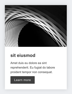
Cards are used in gallery and carousel widgets. You can set a default style so your cards always look cohesive.
Click on elements within the card to style them. You can customize:
- The whole card: background, border, shadow, spacing, and alignment
- The image: image ratio, scale, and spacing
- Text: fonts, spacing, and text shadow
- Button: full-width, background, border, shadow, spacing, and alignment
Cookie consent
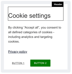
Every Foleon Doc has cookies, and according to GDPR, you need to inform your readers about these cookies.
📖 Learn more in our article: All about cookie consent
Click the elements in the card to set the style. You can style the title, paragraph text, privacy policy link, and buttons.
By default, the title will use the Header 2 font style, and the paragraph text will use the paragraph font style. You can change them if you want to deviate from these default styles.
Cookie content supports up to three buttons. You can style Button 1 and Button 2 in Brand Settings. If a third button is included in your cookie consent, it will automatically inherit the style of Button 2.
⚠️ If the cookie consent modal is disabled in the Doc setting, you'll see a tooltip informing you that you can't change the styling in the brand settings.