![foleon_logo_white.png]](https://www.foleon.com/hs-fs/hubfs/foleon_logo_white.png?height=40&name=foleon_logo_white.png)
In this article
📖 Already have a Brand Kit set up? Learn how to apply it to your Docs: Apply a Brand Kit to a Foleon Doc
What is a Brand Kit?
A Brand Kit is your collection of standard fonts, colors, logos, and styling defaults that ensures every Foleon Doc reflects your brand identity from the start. When creating a Brand Kit, you define the brand settings that will be automatically applied to your Foleon Docs.
Instead of adjusting styles manually for each Doc, Admins and Designers can define them once in a Brand Kit. This gives creators a ready-made framework that helps them save time, stay on brand, and focus on the content.
You can apply Brand Kits in the following places:
- New Foleon Docs — When creating a new Doc from scratch, the styling from the default Brand Kit applies automatically.
- Existing Foleon Docs — You can apply a Brand Kit to existing Docs.
- Templates — When creating a new template in a workspace with a default Brand Kit, the styling will apply to page, block and overlay templates.
- View modes — You can style each view mode (desktop, tablet, and mobile) in a Brand Kit.
You can set global styling for specific elements—such as fonts, buttons, and data elements—for tablet and mobile view modes in your brand settings.
- When you update these elements while in the desktop view mode, the changes apply to desktop, tablet, and mobile views.
- When you update them in the tablet view mode, the changes apply to both tablet and mobile views.
- When you update them in the mobile view mode, the changes apply to mobile view only.
Where to create your Brand Kit: Brand Console or Workspaces
You can create Brand Kits in two places: the Brand Console or individual workspaces. Where you create your Brand Kit depends on how much control or flexibility your team needs.
💡 Not sure where to create your Brand Kit? We recommend starting in the Brand Console for better visibility and control.
Use this table to help you decide where to create your Brand Kit:
| Brand Console | Workspace | |
| Use it when you want... | Tight control over brand styling across all workspaces | Teams to have more flexibility or autonomy over styling |
| Who can create & edit | Admins & Designers with access to the Brand Console | Workspace-level Admins & Designers |
| Availability | Can be assigned to one or more workspaces | Only available within the workspace where it was created |
| Best for | Central brand governance across all teams | Local, campaign, or regional flexibility |
| Example use case | One company brand applied across all workspaces |
A regional team with its own branding |
⚙️ Brand Governance Settings
Your brand governance settings control whether Brand Kits can be created in workspaces or only in the Brand Console. Admins and Designers with access can choose to allow or restrict Brand Kit creation at the workspace level.
How to create your Brand Kit
There are two ways to create a Brand Kit:
Start from Scratch
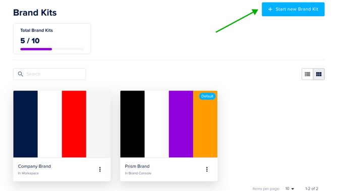
To create a Brand Kit from scratch, navigate to either the Brand Console or the workspace where you want to manage styling. Then click on the Brand Kits page. Click + Start new Brand Kit.
⚠️ Depending on your plan, you can create multiple Brand Kits. If you're interested in adding more Brand Kits to your plan, contact us here.
You’ll now be in the Brand Kit builder. On the right-hand side of your screen, you'll see the brand settings panel where you can style fonts, buttons, colors, and logos.
📖 For an overview of all the elements you can style, see our article: All about the brand settings
To preview your styling, click Brand in the top bar. This collapses the settings panel so you can view the full page. Click Brand again to reopen the panel and continue editing.
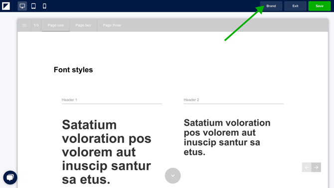
When you're happy with your setup, click Save.
A pop-up window will appear where you can:
- Give your Brand Kit a name
- Choose whether to set it as your default Brand Kit
- Click Save
You can now apply this Brand Kit to your Foleon Docs for consistent styling, saving you time and resources.
If you created your Brand Kit in the Brand Console, continue to the next section: Assigning a Brand Kit to Workspaces.
If you created your Brand Kit in a Workspace, it will now be available for use within that workspace.
If this is the first Brand Kit in your account, it will be automatically set as the default Brand Kit for your workspace(s).
You can edit your Brand Kit at any time by clicking the quick actions menu (three dots) on your Brand Kit. Any updates won't retroactively apply to Docs where the Brand Kit has already been applied. If you delete a Brand Kit, existing Docs that use it will remain unchanged.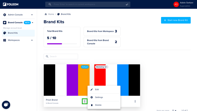
Start from the Brand Settings in a Foleon Doc
If you've already set the styling in the brand settings on your Doc, you can save this as a new Brand Kit so you don't need to start from scratch.
After you've made changes to the brand settings, you'll see an icon: Save as new Brand Kit. Click here to name your Brand Kit and save. A new Brand Kit will be automatically saved in your workspace based on the brand settings you created in your Doc.
📖 Learn more in our article: All about the brand settings

Create Color Modes in your Brand Kit
With Color Modes, you can pre-define how your brand colors adapt across different contexts — light or dark backgrounds, high-contrast layouts, or campaign-specific themes. Instead of manually adjusting colors block by block, you apply a mode with a single click and everything updates automatically.
💡 Color Modes are configured in the Brand Kit and applied to blocks, columns, and elements in your Docs.
Create a Color Mode
- In your Brand Kit, navigate to the Content tab.
- Click the + button next to the mode tabs to add a new mode.
- Set a background color for this mode.
- With the mode active, manually adjust the styling for fonts, buttons, dividers, data elements, forms, cards, and cookie consent. Any changes you make will be saved specifically to that mode.
- Use the kebab menu (⋮) on each tab to rename, duplicate, or delete a Color Mode.
Once your modes are created, they become available when editing a Doc. Color Modes can only be edited in the Brand Kit, not from within a Doc.
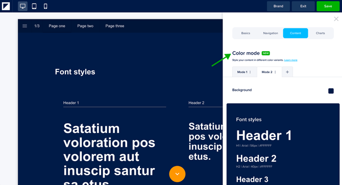
💡 You can create up to 5 color modes
⚠️ Mode 1 is your default mode and cannot be removed.
Apply a Color Mode to your content
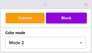
Once you've created your Color Modes in the Brand Kit, you can apply them to blocks, columns, and elements in your Doc.
- Select a supported element, such as a block, column, card, button, text, form, hotspot, or divider.
- In the settings panel, open the Color Mode dropdown.
- Select your desired mode.
💡 You don't need to set a mode on every individual element. If a block or column has a mode applied, all supported elements inside it will follow that mode automatically.
⚠️ Color Modes are not supported on image elements, social icons, tables, and charts. These will retain their existing styling regardless of the mode applied.
How Color Modes behave
-
Modes override inline styling
When you apply a mode to an element, any manual color overrides on that element are automatically removed so the mode's colors take effect. If you apply a mode to a block or column, all supported elements inside it — text, buttons, dividers — will switch to that mode's colors. -
Modes work across levels
You can mix modes at different levels. For example, if you want a specific Light card inside a Dark block, set the card's mode manually. The block's mode will no longer control that card — the card-level setting takes priority. -
Inline styling after a mode is applied
Applying a mode doesn't lock your styling permanently. You can still make manual adjustments after — for example, changing a button color within a Dark mode section. Your manual change will stick unless you re-apply the mode to that element later.
Duplicate or Move a Brand Kit
You can duplicate any Brand Kit, whether it was created in a workspace or the Brand Console, and move it to another location. This is useful if you want to:
- ♻️ Reuse a Brand Kit in a different workspace
- 🏢 Move a Brand Kit from a workspace to the Brand Console for centralized management
- ↔️ Move a Brand Kit from one workspace to another
To duplicate a Brand Kit, first navigate to the Brand Kit you want to copy or move. Click the quick actions menu (three dots) on your Brand Kit and select Duplicate.
⚠️ If you've reached your Brand Kit limit, you won't be able to duplicate it to the Brand Console. Please contact your Customer Success Manager to explore your options.
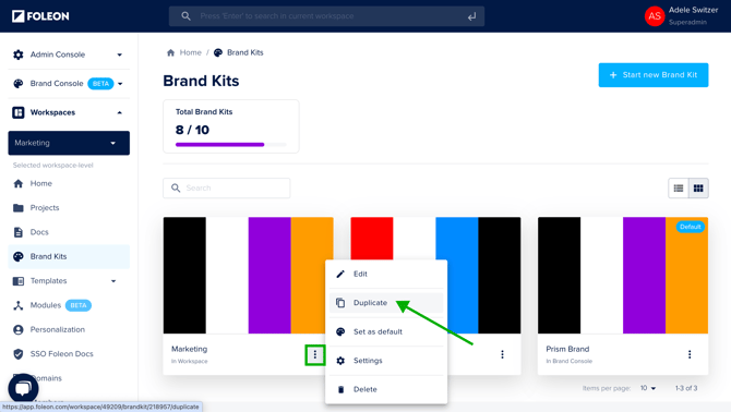
Rename the Brand Kit, if needed. Under Workspace, choose where to copy the Brand Kit. You can choose either the Brand Console (recommended) or a workspace. Click Duplicate.
💡 If your goal is to manage a Brand Kit centrally, we recommend duplicating it to the Brand Console. This gives you greater control and allows you to assign it across workspaces.
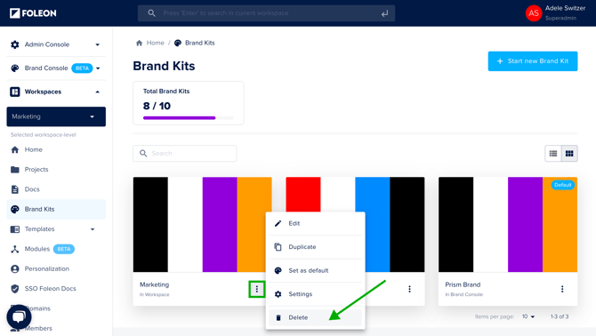
After duplicating, your new Brand Kit will appear in the destination you selected. If applicable, delete the original Brand Kit.
⚠️ If you moved your Brand Kit to the Brand Console, don't forget to assign it to your workspace(s) and delete the original Brand Kit. If you do not delete it, workspace users will still be able to use the original Brand Kit, leading to confusion.
What happens after you delete the original Brand Kit?
-
Any Foleon Doc that previously used the deleted Brand Kit will retain its styling, but will no longer have a Brand Kit applied
-
If you plan to continue updating those Docs, we recommend applying the new Brand Kit to keep them aligned with your current brand standards
-
All new Docs can be created using the new Brand Kit, or set it as your default for the workspace
Assigning a Brand Kit to Workspaces
If you've created a Brand Kit in the Brand Console, you'll need to assign it to one or more workspaces before it can be used:
-
Open the Brand Console and navigate to the Brand Kits tab.
-
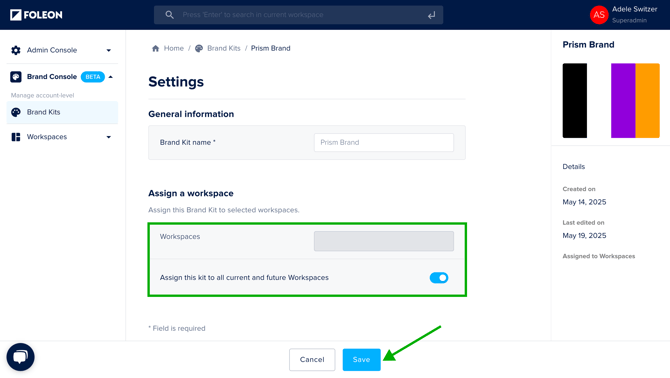
Click the quick actions menu (three dots) on your Brand Kit and select Settings.
Under Assign a workspace, choose the applicable workspaces from the dropdown.
-
Or, if you want your Brand Kit available to all workspaces, toggle on Assign this kit to all current and future workspaces. Click Save.
After the Brand Kit has been assigned:
-
The Brand Kit becomes visible in the selected workspaces
-
Workspace teams can now apply the Brand Kit to their Foleon Docs
-
Only company-level Admins and Designers can edit centrally managed Brand Kits — Workspace teams can use them, but not change them
Having multiple Brand Kits
If your account supports multiple Brand Kits, content creators can switch between them to ensure content aligns with the right brand identity — whether it’s for different departments, regions, or campaigns.
⚠️ Only select plans include multiple Brand Kits, with a set limit based on your plan. If you're interested in adding more Brand Kits to your account, contact us here.
From the Brand Kit tab in either the Brand Console or a workspace, you can view how many Brand Kits your account currently has and how many remain available.
In the Brand Console, you'll also see a breakdown of how many Brand Kits were created in the Brand Console and on individual workspaces.
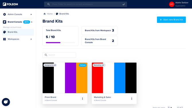
The image above shows an account that has 10 available Brand Kits:
- 2 Brand Kits were created in the Brand Console
- 3 Brand Kits were created in workspaces
- 5 Brand Kits are still available
Setting a default Brand Kit
Setting a default determines which Brand Kit is automatically applied on all new Docs.
To set a default, navigate to the Brand Kit tab in either your Brand Console or the workspace.
If you set a Brand Kit from the Brand Console as the default, it will override any workspace-level default that may have been previously set and you will not be able to assign a workspace Brand Kit as the default.
Click the quick actions menu (three dots) on the Brand Kit and select Set as default.
💡 The default Brand Kit will automatically apply to all new Docs in that workspace, but will not retroactively apply to existing Docs.