![foleon_logo_white.png]](https://www.foleon.com/hs-fs/hubfs/foleon_logo_white.png?height=40&name=foleon_logo_white.png)
Add a full-width slider to your page and let your audience scroll through slides, making your visuals more interactive and engaging. ➡️ In this article, we show you how to add a slider to your page and customize it to fit your needs.
⚠️ This feature is not available for legacy plans. If you are interested in using the slider widget, contact us here.
In this article
What is the slider widget?
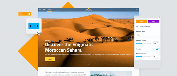
A slider widget displays a rotating set of content, allowing your audience to swipe or scroll through full-width slides. This makes it ideal for showcasing multiple high-impact visuals or calls to action in a single, engaging block.
By default, each slide contains a background image, text, and a button. Unlike the carousel widget, the slider widget can loop infinitely and includes a dot navigation at the bottom, making it especially useful for immersive, image-led storytelling.
How to add a slider
Step 1: Drag and drop
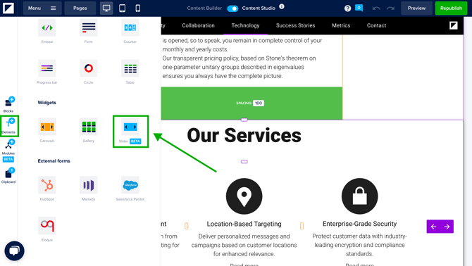
In the editor, click elements and scroll down to the widgets section. Drag and drop the slider onto your page.
💡 The slider widget takes up a full block, so you can drop it in between blocks.
A slider starts with three slides by default and has a maximum of 10. You can customize your slider as follows:
Step 2: Adjust the slider settings
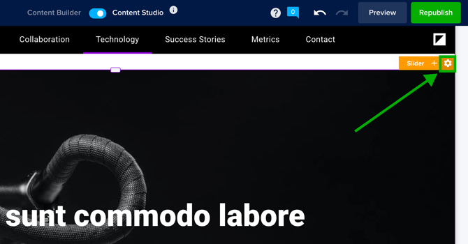
Slider settings control the overall appearance and behavior of your slides. Any changes made here will apply to all slides.
To manage the slider settings, navigate to the orange bar in the top-right of the block and click the settings icon ⚙️.
From here, you have the following options:
- General settings
- Slide layout
- Pagination
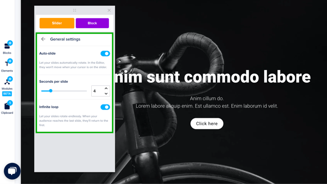
General settings
- Auto-slide: Turn on auto-slide if you want the slides to rotate automatically.
- Seconds per slide: Define how long each slide stays visible before transitioning.
- Infinite loop: Enable this to let your slides rotate endlessly. When your audience reaches the last slide, they’ll return to the first.
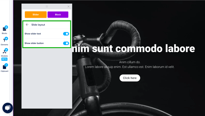
Slide layout
This section allows you to show or hide the text and buttons on each slide. For example, turning off the show slider button removes the buttons from all slides.
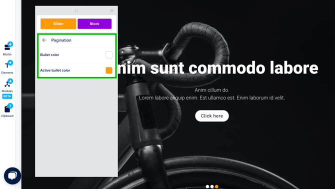
Pagination
Pagination refers to the dot navigation at the bottom of the slider that allows users to navigate between slides. Here, you can customize the colors of the bullets to match your brand.
💡The active bullet indicates the current slide. We recommend making this a different color to help users navigate between slides.
Step 3: Add, delete, or reorder slides
- To add a slide: Click on your slider and press the plus button ✚ on the orange bar.

- To delete a slide: Scroll to the slider you want to delete. Click the trash icon on the blue bar.

- To change the order of your slides: Click the right or left arrows on the blue bar.
Step 4: Customize your slides
Each slide has its own layout, including a background image, text, and button. Each of these elements can be edited and customized.
First, navigate to the slide you want to edit. If auto-slide is turned off, use the pagination dots at the bottom to move between slides.
- Background image: To change the background image, click the slide you want to edit, then select Change background from the blue settings bar. This opens the settings window. From there, click the existing image to open the media library and choose a new one.

- Text: Click directly on the text to begin editing. You can use the top bar to adjust fonts, colors, alignment, and more.

- Button: Click the settings icon on the black bar to adjust the link or change the button style. To edit the button text, simply click and type directly on the button.

For additional settings, click the settings icon ⚙️ on the blue bar. Here, you can change the background image, adjust the spacing on the sides of your slide, or change the alignment.
💡If you make changes to the spacing or alignment that you want to apply to all slides, click Apply at the bottom of the settings window.
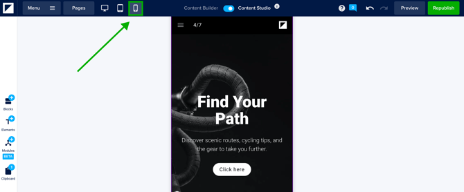
Slider on tablet and mobile
The slider widget is completely responsive and functional on tablet or mobile devices. It works well on mobile screens because it uses horizontal scrolling, which is natural for touchscreens and saves vertical space. Check the tablet or mobile view mode in the editor to see how your slider looks on different devices.
Gallery vs. Carousel vs. Slider: Choosing the right widget
When displaying interactive content in your Doc, you can choose between the gallery, carousel, and slider widgets. Each offers a unique way to present your content, depending on your goals and layout preferences. Below is a quick comparison to help you decide which widget to use:
Gallery Widget
Use the gallery when you want to show multiple cards in a grid-like layout. This is ideal when you want all items visible at once to encourage browsing or when you want to display a larger number of visuals in a digestible way.
✅ Best for: Browsable content collections, like portfolios or product grids.
Carousel Widget
Use the carousel when you want to display a curated set of cards in a scrollable, linear experience. The carousel supports rich content per card and is great for storytelling or highlighting a sequence of ideas.
✅ Best for: Guided content journeys, product highlights, or testimonials.
Slider Widget
Use the slider when you want to create a full-width, immersive experience. Unlike the carousel, the slider is optimized for larger visuals and includes features like auto-slide, infinite loop, and pagination.
✅ Best for: Visual storytelling, splash sections, or impactful CTAs.