![foleon_logo_white.png]](https://www.foleon.com/hs-fs/hubfs/foleon_logo_white.png?height=40&name=foleon_logo_white.png)
💡 When you're working with the Content Builder, element settings are limited. The element settings described in this article mostly apply to working with the Content Studio.
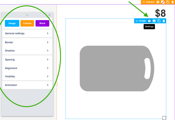
How to access element settings
To access the element settings, hover over the element and click on settings in the element bar. This will open up a pop-up window for the settings you can control for that element. In the example below, you see the settings that apply to an image element.
💡 To learn more about the settings for a specific element, we recommend reading the in-depth article on that element.
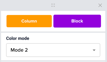
Color Mode
Elements: Block - Column - Card - Button - Text - Form - Hotspot - Divider
Apply a Color Mode to instantly update an element's colors to match a predefined style from your Brand Kit — such as a light or dark theme. Color Modes can be applied to an entire block or column, or to individual elements like cards, buttons, and text for more granular control.
💡 Color Modes are created and edited in the Brand Kit. Learn more in: Govern your brand with a Brand Kit
How Color Modes behave
-
Modes override inline styling
When you apply a mode to an element, any manual color overrides on that element are automatically removed so the mode's colors take effect. If you apply a mode to a block or column, all supported elements inside it — text, buttons, dividers — will switch to that mode's colors. -
Modes work across levels
You can mix modes at different levels. For example, if you want a specific Light card inside a Dark block, set the card's mode manually. The block's mode will no longer control that card — the card-level setting takes priority. -
Inline styling after a mode is applied
Applying a mode doesn't lock your styling permanently. You can still make manual adjustments after — for example, changing a button color within a Dark mode section. Your manual change will stick unless you re-apply the mode to that element later.
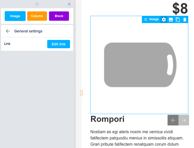
General Settings
Elements: Image - Button - Divider - Share - Hotspot - Embed - Form - Counter - Progress bar - Data
The General settings vary for each element. In here, you might be able to link to an external URL, or apply a background color.
If you want to learn more about the settings for a specific element, we recommend reading the in-depth article of that element.
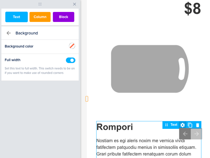
Background
Elements: Title - Paragraph - Button - Share - Hotspot - Quote - Form
The background color of these elements can be set to any color. By default, there is no background color set. When a background color is selected this can not be un-selected. The only thing you can do to change it back is to change the color to transparent.
With text elements, the color can be behind the text only, or as wide as the entire element. This can be set by switching the Full-width switch.
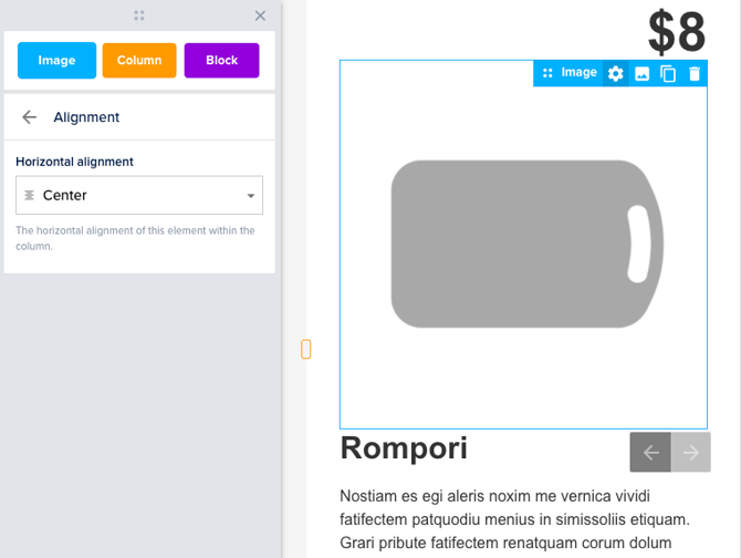
Alignment
Elements: Image - Button - Divider - Video - Embed - Share
With this option, you can change the alignment of the content within the element itself. The content can be aligned Left, Center, or Right.
💡 You can also align text elements, which you can do in the text bar.
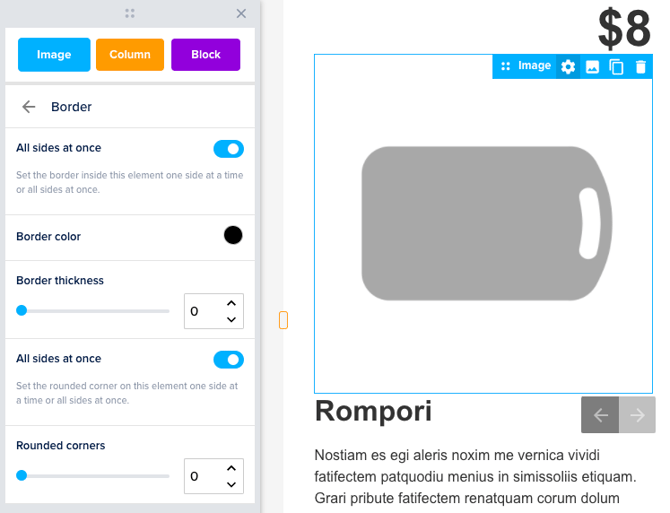
Border
Elements: Title - Paragraph - Image - Button - Video - Share - Quote - Hotspot - Embed - Form
The border option allows you to create a full border or a border on specific sides of your element. All sides at once is selected by default, which means that when you increase the Border thickness, the same amount of border will appear on all sides at the same time.
When All sides at once is deselected, the option to increase the amount of the border for each side will appear. It is also possible to add more than one border. Every border will have the same color that is selected at the Border color picker.
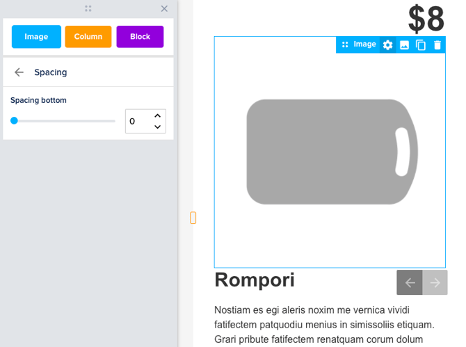
Spacing
Elements: Title - Paragraph - Image - Button - Divider - Video - Share - Quote - Form - Embed - Data
Spacing can be increased to create more space between the border of the element and the content within the element.
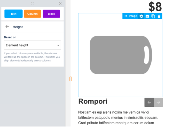
Height
Elements: Title - Paragraph - Quote - Button - Image
The element height setting enables you to create consistent card-like layouts — by aligning elements horizontally across columns. This layout is useful for pages that feature a product catalog or a Meet the team section, just to give you an example.
💡Learn more in our article Align elements horizontally with height.
Shadow
Elements: Title - Paragraph - Image - Button - Divider - Video - Quote - Hotspot - Form
You can add a shadow to most of the elements. Choose the Shadow color with the color picker. After selecting the color you can choose the Horizontal position and Vertical position. The blur radius can be used to make the shadow less harsh and a bit more faded.

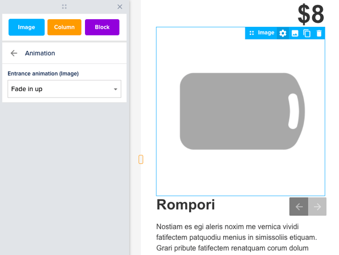
Animation
Elements: Title - Paragraph - Image - Button - Divider - Video - Share - Quote - Form - Data
The Entrance animation of the element can be selected in the drop-down menu. This animation will show once when the page is opened.
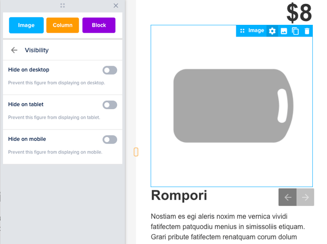
Visibility
Elements: Image - Button - Video - Hotspot - Button
With this option, it is possible to choose where the element is visible. This allows you to show certain elements on desktop but hide them on mobile, or the other way around.