

Introduction
How often have you come across a website that looked great on desktop but was a disaster on mobile?
Even today, most content created for the web is designed with the desktop in mind, even though an estimated 85% of internet traffic now uses smaller screens. If you don’t consider mobile devices, your visitors will have an entirely different experience than you intended.
However, working with professional designers to make all your content responsive can be an expensive and time-consuming process. If you've chosen to take design work into your own hands with Foleon, we have plenty of options and features to save you time while building beautifully responsive content.
Making the most out of Foleon’s responsive design capabilities
Adaptability, typography, white space, and image size are all critical factors to consider when it comes to responsive design. Here are some tips on taking advantage of Foleon’s features to make your publications responsive.
1. Design for different devices
In general, there are 3 device layouts you should care about: desktop, mobile, and tablet. With a regular website, a reader's browser automatically determines how best to display the page based on CSS media queries — instruction in the code that tell browsers how to display content depending on the screen resolution.
Since Foleon comes with built-in view modes that let you design for specific devices, you don’t have to worry about adding custom media queries yourself.
At the top-center of the editor, you’ll see a button where you can change the size of your viewport from desktop to mobile or tablet.
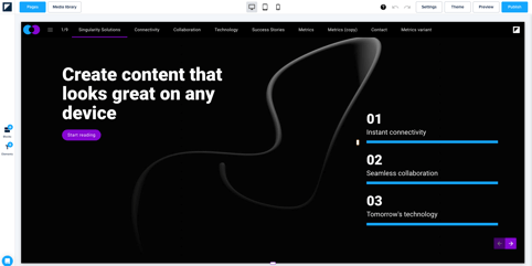
You can toggle between your 3 views to see how your layout changes. Each viewport allows you to preview and adjust your design within the boundaries of each device type.
Tablet view: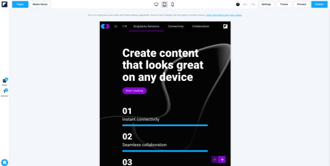
Mobile view: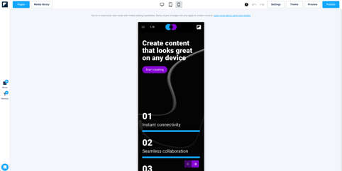
While all of our templates are already optimized for every screen size, as you add additional content, there will be times when you want to make fine adjustments — and this is where the ability to change your viewport right in the editor becomes handy.
The content you add while working in one viewport will also be added to the other views, so there's no need to design a new layout for each view size. However, Foleon also allows you to tweak some design aspects on tablet and mobile without affecting the other views. We'll explain this in more detail later on.
2. Show or hide content in different view modes
Taking a one size fits all approach is a mistake many first-time designers make. Since every individual element is essential to the flow of your publication, the urge to preserve everything visible on your desktop view is understandable. However, cramming everything onto a smaller screen isn’t always the best solution.
For example, showing too many images on mobile may not be ideal for specific reasons such as increasing load time, which can drain your reader’s mobile data capacity. You can readily hide specific images (or elements) in Foleon’s different view modes.
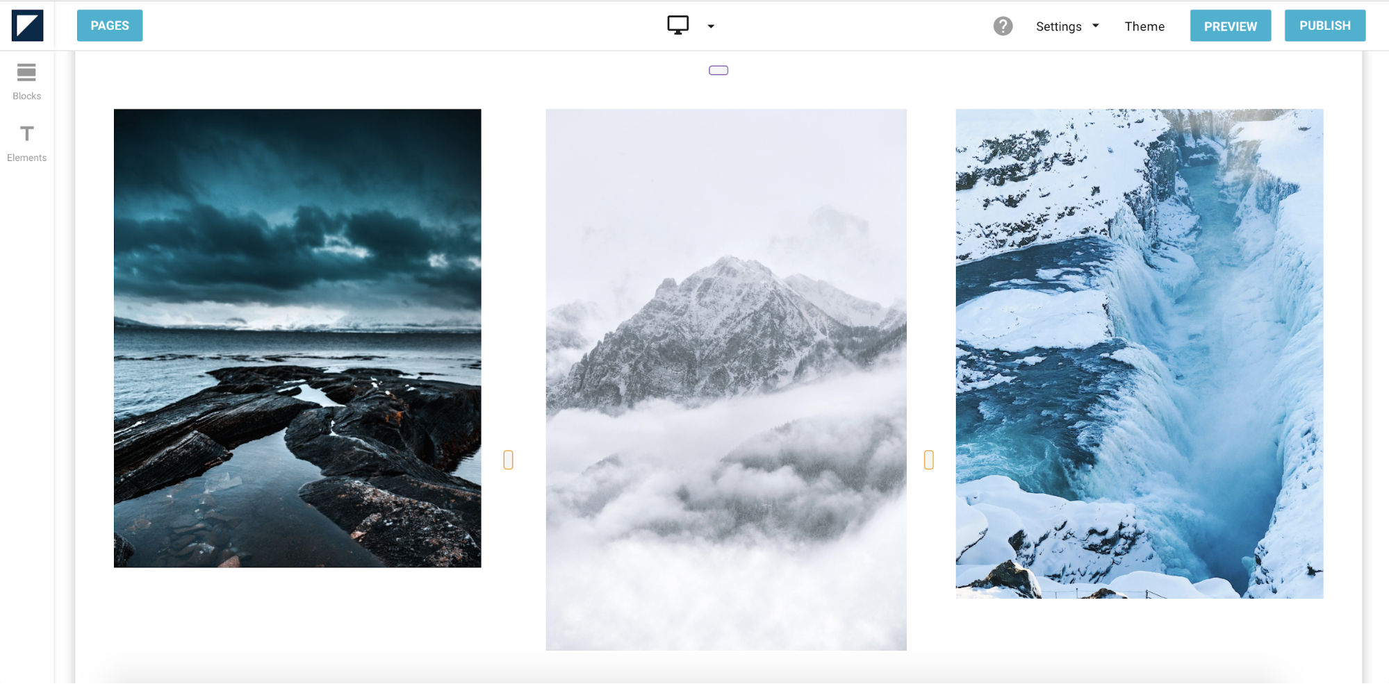
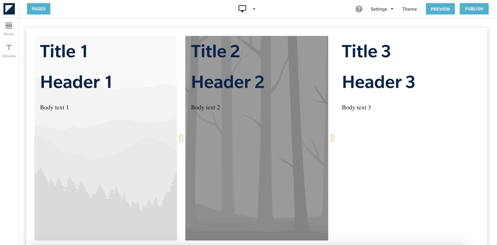
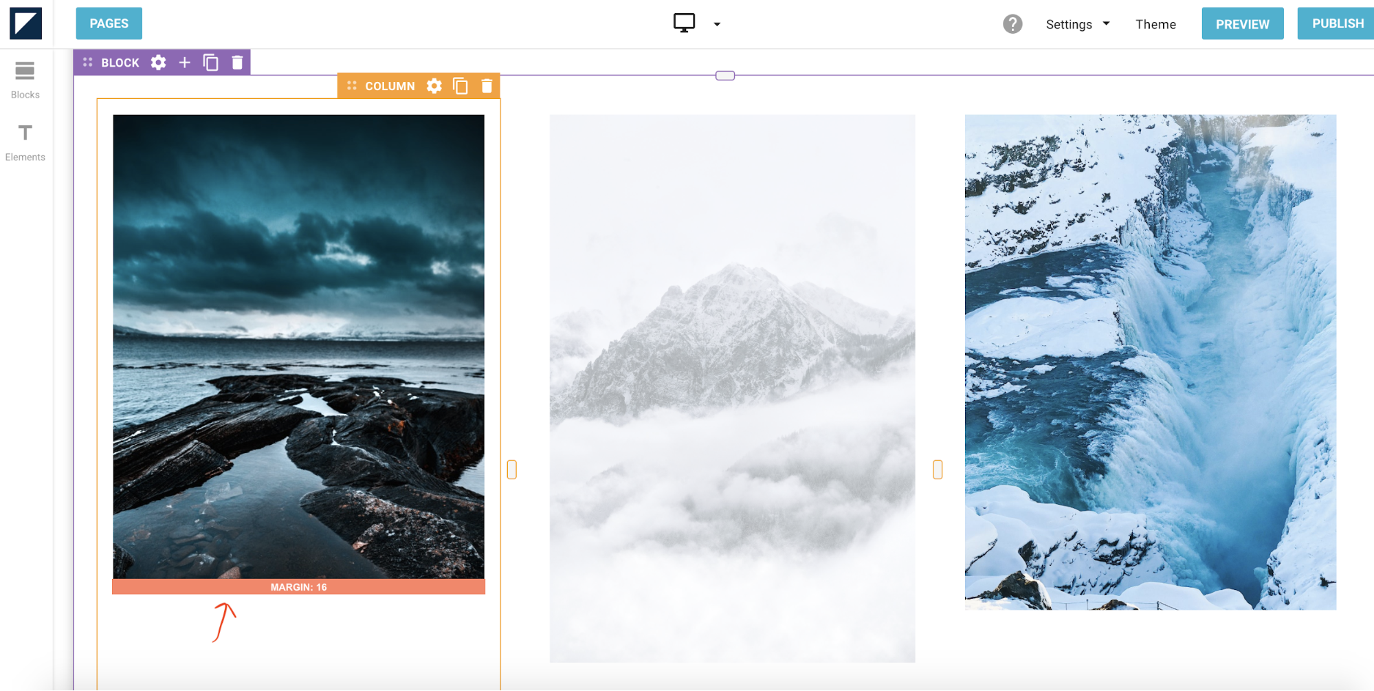
The page below contains 3 images on desktop view. Each image is housed in its own column.
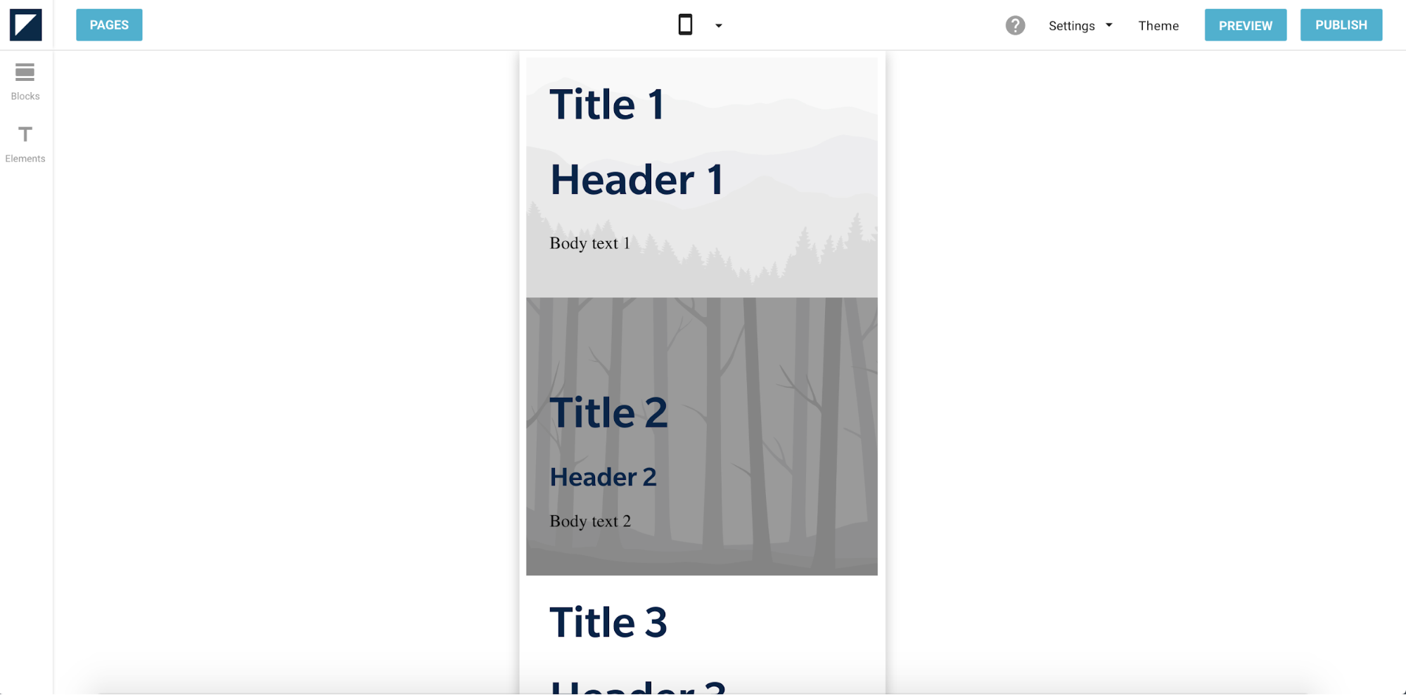
But on mobile view, these images are automatically stacked into a single column:
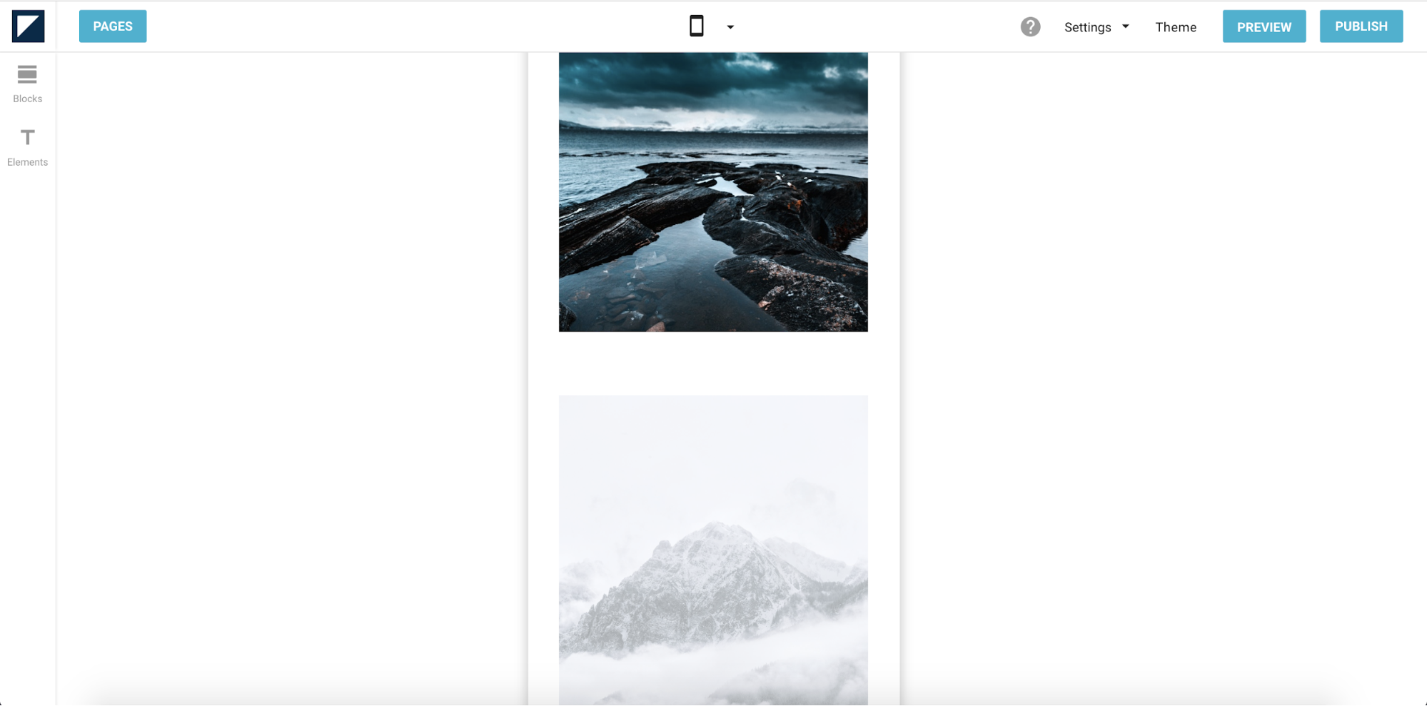
This stacking inevitably increases your page length on mobile. You can hide elements for particular view modes to avoid making your page undesirably long.
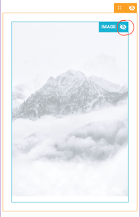
On desktop view, all elements are visible by default. You must navigate to its settings to hide a specific element in this view mode. Hover over the element — in this case, the image — and click on the gear icon on the top right corner of the element. This will reveal the element settings.
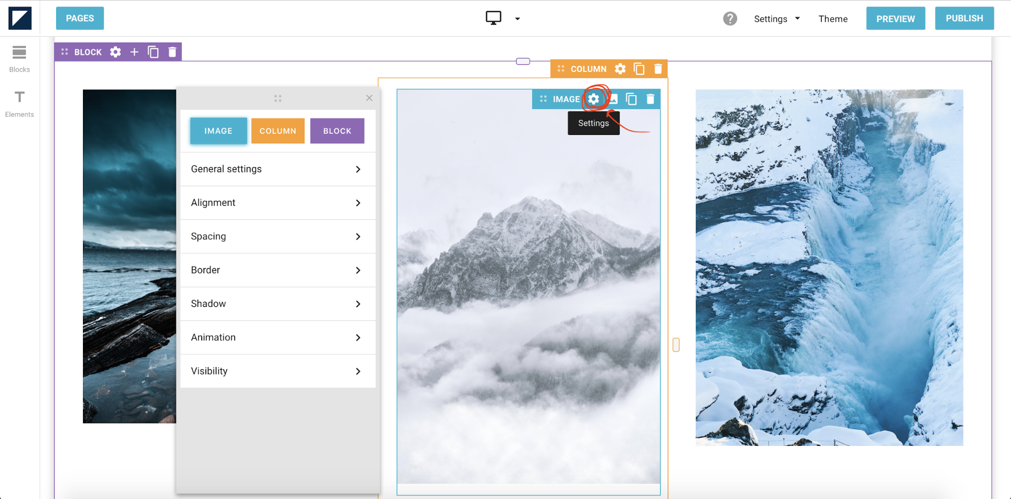
Once you’re in the image’s settings panel, click on visibility.
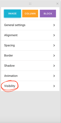
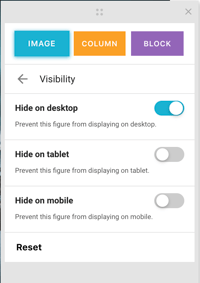
Inside the visibility settings, you will see toggle buttons to hide the element for each view mode. Select the view mode for which you want to hide your element.
While working in mobile and tablet view modes, hiding specific elements is even easier. You just hover over it until you see an eye-shaped icon in the top right corner.
Click on the icon to hide the element. Your element will be greyed out and will not appear in your publication in that view mode — but will still be visible in other views.
Note that you also have the ability to hide columns on mobile and tablet views. This feature isn’t available on the desktop view because columns are arranged next to each other.
3. Adjust your typography for different screen sizes
When it comes to responsive design, many people fail to give proper attention to typography choices. It's essential that your text be legible on every screen size. A good rule of thumb to determine the appropriate font size for each device is to notice whether you’re squinting. You're in the clear as long as you don’t struggle to read the text.
Desktops have more screen real estate for landscape layouts and can accommodate more text. On the other hand, mobile devices have more narrow screens that are not ideal for multi-column layouts.
If you have multiple text columns on a desktop, Foleon will automatically stack them vertically on smaller view modes to accommodate the narrower screen.
Desktop view:
Mobile view:
It's important to know that only certain changes you make to your typography will automatically apply to other view modes. Here's how this works:
Typefaces
If you change the typeface of a text block while in desktop view, the changes will carry over to both tablet and mobile views. If you change your typeface while in tablet view, however, it will only carry over to mobile view; it will not affect the desktop view. In this sense, typeface changes trickle downwards but not upwards.
Font size
Foleon automatically assigns font sizes proportional to each view mode, which means your text’s font size will differ slightly on desktop, tablet, and mobile views by default.
Similar to typefaces, changes you make trickle down. Font size adjustments are only carried over to smaller screen sizes, but not vice versa.
This means making font adjustments in mobile view will affect neither tablet nor desktop views. You'll see a message in the tablet and mobile views that your changes will not apply to larger view modes.
There is a good reason for this. Text that looks good on smaller screens won’t necessarily translate well onto bigger screens. Adjusting your text on different screen sizes without affecting other sizes ensures you can achieve the right look on any device.
4. Create white space with one simple gesture
Foleon lets you adjust padding around each element so you can change how much space you want to have around your content. To do so, hover over the side of the column you wish to adjust until you see a green padding bar.
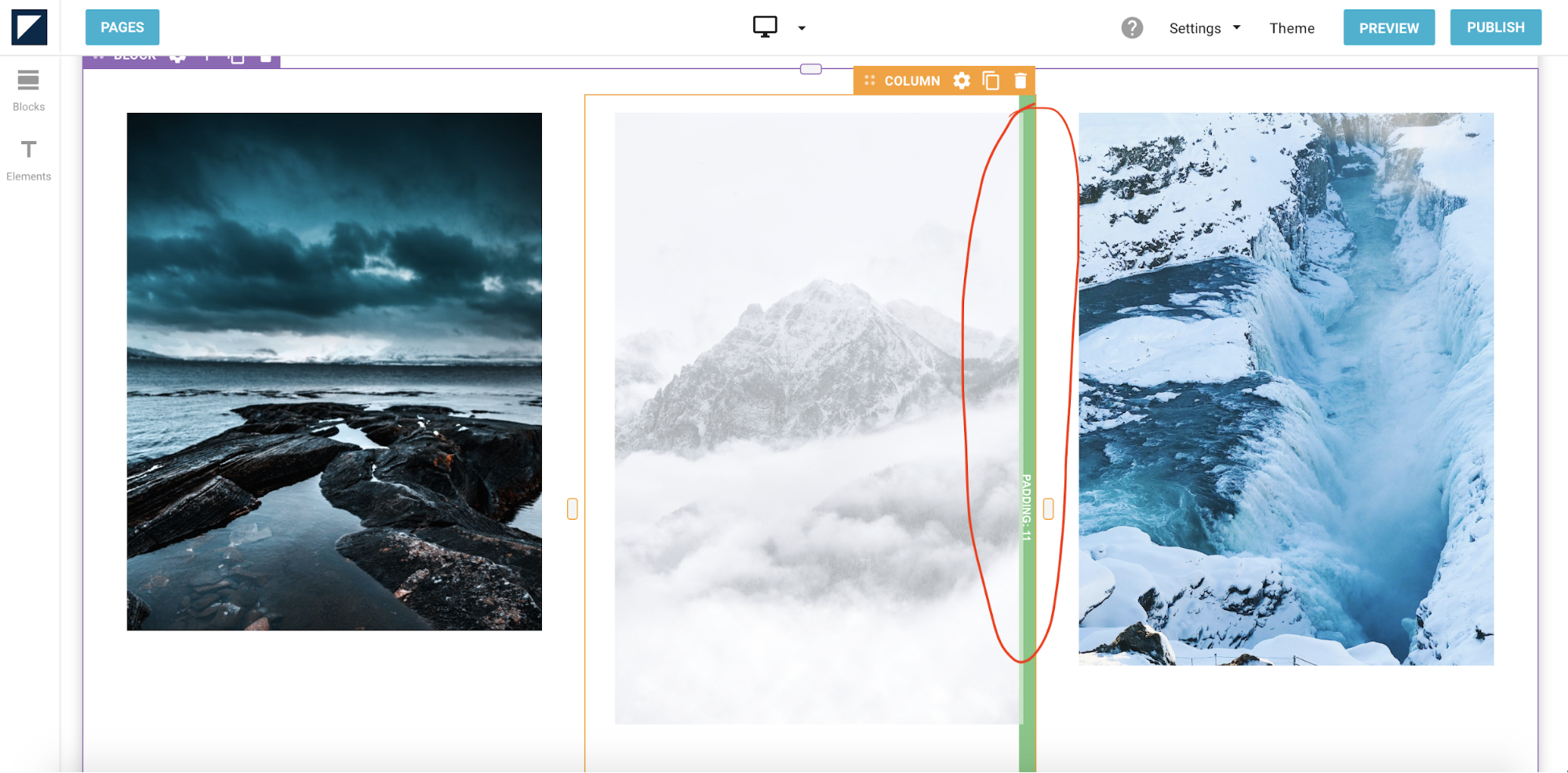
Your cursor will turn into arrows that indicate which direction you should drag. Adjust the green bars accordingly to either widen or restrict the amount of padding you want for each column. You can do this on all four sides of a column.
The same can also be done for margins, which will turn red on hover.
This feature is especially helpful for fine tuning the amount of whitespace you want to use in your publication. Whitespace can be used to visually separate information into sections while preserving your layout. Making the most out of whitespace helps you effectively section your blocks without relying on borders and lines.
5. Instantly trim your images
Images and visuals are a large part of what makes publications appealing. When selecting images, make sure they complement your publication’s overall design.
Read more about selecting images.
The media library has a built-in image cropper so you can customize how images display across screen sizes without using Photoshop. No matter their orientation, your images will fit neatly into your content when viewed across different devices.
When adding an image to your publication, Foleon automatically scales it to fit into your column. For example, if you upload a portrait image to a wide column that would better fit a landscape image, the column will automatically expand vertically to accommodate the entire portrait image. The image will fill the entire column width.
But what do you do if you want your image to fit within the confines of your original column size? You can crop or scale the image right in the editor. Simply hover over the image, and a white square will appear on the bottom right-hand corner of the image.
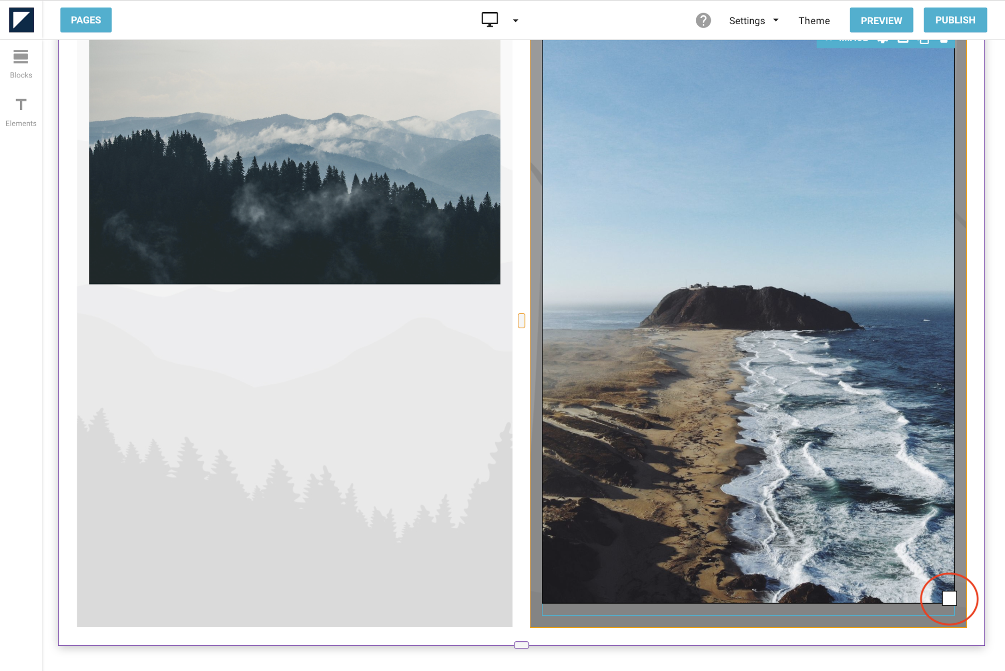
Click on this white square and drag it diagonally until you have your desired size.
If you have a portrait image that has been scaled to fit into a wide area, you may want to realign it so that the spaces around your image are balanced out.
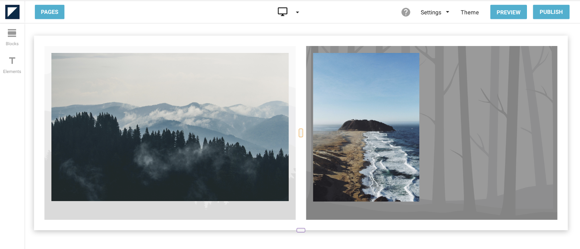
In this photo, the image on the right has been scaled to fill the column that houses it. By default, this aligns the image to the left of the column. To balance out the space around the image, you can realign your image via its settings.
Hover over the image and click on the gear icon on the top right corner of the image to access its settings. Next, click on Alignment. You’ll be prompted with a drop-down menu that allows you to select how you want to align your image.
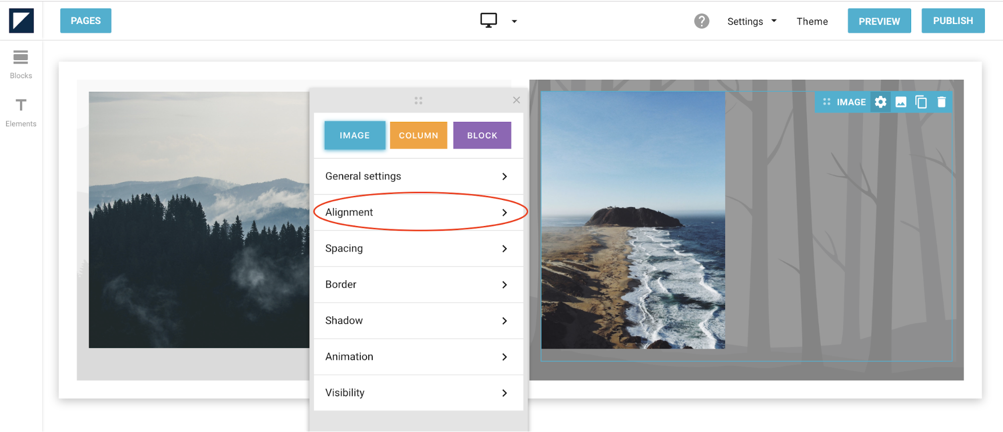
In this example, we’ll center-align the image.
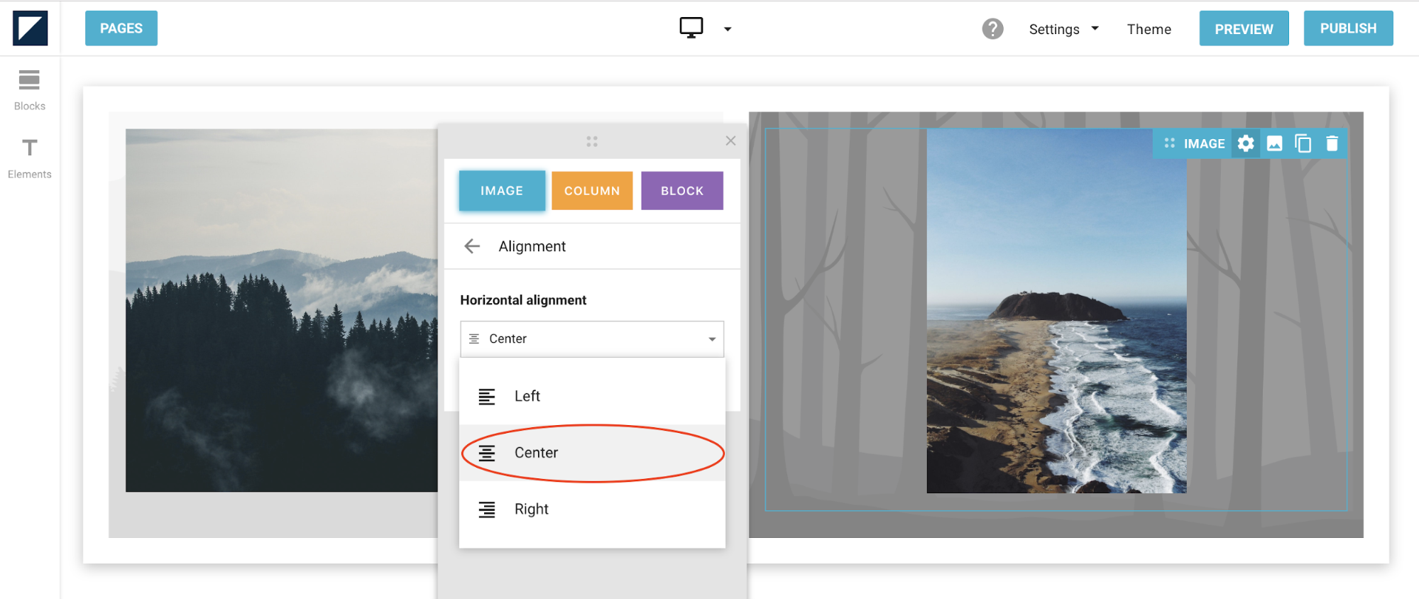
Your image will now be aligned in the center of the column.
Conclusion
There’s no getting around the fact that screens come in many sizes these days. Whether your readers are iPhone loyalists or Android phone devotees, they’ll view your content across all devices. With increasing expectations for better mobile viewing experiences, making your content responsive can no longer be underestimated.
Luckily, it’s never been easier to create device-agnostic and adaptable content. Using a content creation tool like Foleon can help you consistently create immersive collateral that keeps your viewers engaged on any screen.
Looking for more help? Check out our Help Center, where you'll find an extensive collection of articles about design, settings, and more.